
Product Pages
Ark Naturals uses multiple product detail page (PDP) layouts depending on the product line. All of them share the same Vue-based product form, ingredients explorer, and Junip reviews block — they differ mainly in the supporting sections placed below the buy box.
Product templates
Each product is assigned a template in Shopify Admin → Products → (product) → Theme template.
| Template | When to use it |
|---|---|
product.json | Default — most products |
product.pro-plus.json | Protection+ products (the clinical line) |
product.pro-plus-alt.json | Alternative Protection+ layout for A/B testing |
product.extreme-clean.json | Extreme Clean variants |
product.breath-bursts.json | Breath Bursts product line |
product.v2.json | Secondary layout used for selected products |
Current section order (from the template JSON):
| Template | Sections (top → bottom) |
|---|---|
product.json | Product · Upgraded (disabled) · Upgraded V2 · Ingredients (slider) · Junip reviews (app block) · Blended Review Widget |
product.pro-plus.json | Product · Upgraded V2 (5 features) · Ingredients (spoiler) · Junip reviews · Blended Review Widget |
product.pro-plus-alt.json | Product · Upgraded V2 (5 features) · Ingredients (slider) · Junip reviews · Blended Review Widget |
product.extreme-clean.json | Product · Ingredients · Upgraded V2 · Junip reviews · Blended Review Widget |
product.breath-bursts.json | Product · Upgraded V2 · Ingredients · Junip reviews · Blended Review Widget |
product.v2.json | Product V2 (main-product-v2, block-based) · Junip reviews · Blended Review Widget |
Every product template has the Junip review list and the Blended Review Widget section. See Product Reviews.
Switching templates
Assigning a different template to a product does not delete content — it just changes which sections render. You can preview any template by appending ?view=… to a product URL (e.g. …?view=pro-plus).
The main product section
Section file: main-product.liquid (also main-product-v2.liquid for the v2 templates)
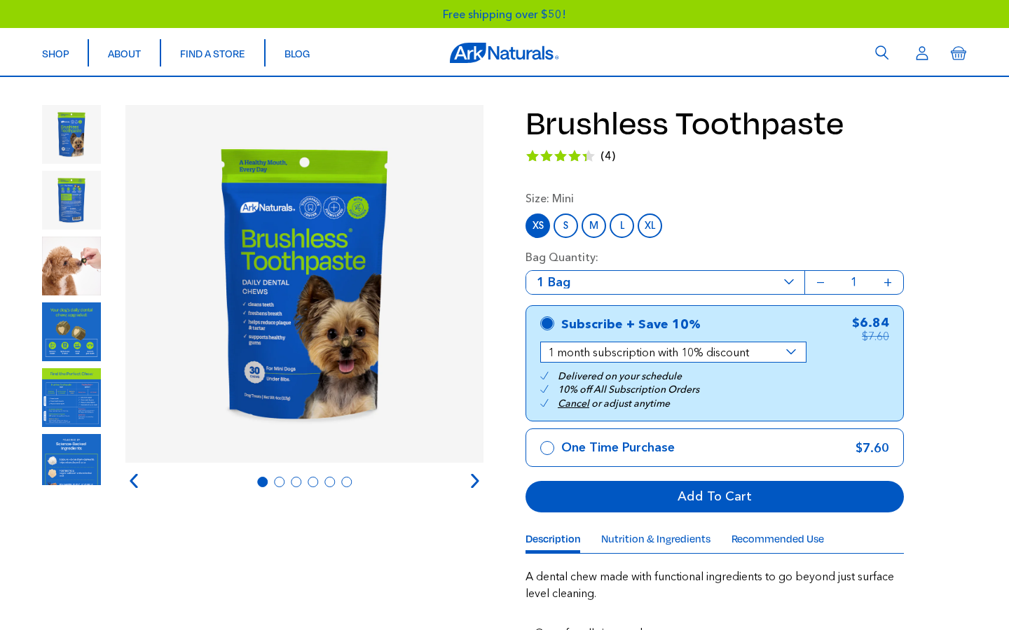
This is the top half of every product page — the gallery, title, price, purchase option toggle, add-to-cart button, and the accordion underneath.
The main product section has no editable settings — its content is driven by the product itself (images, title, description, variants) and by the metafields described below.
What's on the page
| Component | Source |
|---|---|
| Product image gallery | Product images (Shopify) |
| Badge above the title | custom.badge |
| Title | custom.display_title if set, otherwise the product title (see Display title) |
| Star rating + review count | Junip, or the blended cross-platform figures when the product has off-site reviews. See Integrations → Blended reviews. |
| Size / flavor options | Variant options + linked products. See Variant & linked-product selectors. |
| Bag Quantity | A static "1 Bag / 2 Bag / 3 Bag" dropdown (not wired to variants) plus a working quantity stepper |
| Purchase option cards | "Subscribe + Save 10%" (with frequency dropdown) / "One Time Purchase", from ReCharge selling plans. See Subscribe & Save. |
| Add to Cart / Find Store | Vue product form (product-form-vuex) |
| Description accordion | product.description |
| Nutrition & Ingredients accordion | Per variant: custom.nutrition + custom.ingredients (variant metafield, falling back to the product metafield) |
| Recommended Use accordion | Per variant: custom.recommended_use (variant, falling back to product) |
Variant-level accordion content
The Nutrition & Ingredients and Recommended Use accordions render one block per variant. The VariantContent Vue component shows only the block of the currently selected variant, so the content swaps when the shopper clicks another size or flavor, without a page reload.
For each variant the theme reads, in order:
| Accordion part | 1st choice | Fallback |
|---|---|---|
| "Nutrition" sub-heading + content | variant.metafields.custom.nutrition | product.metafields.custom.nutrition |
| "Ingredients" sub-heading + content | variant.metafields.custom.ingredients | product.metafields.custom.ingredients |
| Recommended Use | variant.metafields.custom.recommended_use | product.metafields.custom.recommended_use |
The "Nutrition" and "Ingredients" sub-headings only appear when that part has content.
Where to edit the accordion content
Description is the product description. For the other two: if all variants share the same copy, fill the product metafields and leave the variant ones empty. If a size or flavor needs different copy, open Shopify Admin → Products → (product) → (variant) → Metafields and fill the variant metafield. It overrides the product value for that variant only.
Display title
product.metafields.custom.display_title (single line text) replaces the product title everywhere shoppers see it: the PDP h1, the breadcrumb, the v2 block-title, layout-product, and the PLP card title (through json-product → displayTitle). Leave it empty to use the normal product title.
It exists for collapsed size families. Each size is a separate product whose title carries the size ("Dental Chew — Medium"). The one tile left on the PLP should read as the name of the whole family ("Dental Chew"). The SEO title and the admin title are unaffected.
Subscribe & Save behaviour
The buy box shows two cards: Subscribe + Save 10% (subscription price + struck-through one-time price) and One Time Purchase. When the customer selects the subscription card:
- A frequency dropdown appears, listing the product's selling plans (
sellingPlanOptions). - Below it a fixed benefits list is shown: Delivered on your schedule · 10% off All Subscription Orders · No obligation, modify or cancel your subscription anytime on our portal.
- The selected
selling_planis sent with the add-to-cart request, so the line item is created as a subscription.
If a product has no selling plans, the subscription card does not appear and only "One Time Purchase" is shown.
The benefits copy is hardcoded
The card label and the three benefit lines live in sections/main-product.liquid. The Theme settings → PDP → Benefits field (pdp_sub_benefits) is not read by any section or snippet, so editing it changes nothing. See Theme Settings → PDP.
Variant & linked-product selectors
Two kinds of pickers can appear above the quantity row:
| Picker | Snippet | Used for |
|---|---|---|
| Variant options | pf-size-flavor-options.liquid | Sizes/flavors that are variants of this product. Pills for sizes, round image swatches for flavors. |
| Linked products | pf-linked-products.liquid → LinkedProductSelector | Sizes/flavors that are separate products, listed in custom.selector_skus. Clicking one swaps the PDP content in place via the Section Rendering API, with no full reload. |
Linked products setup
Each product in the set needs:
| Metafield | Example | Purpose |
|---|---|---|
custom.selector_skus | list of the sibling products | Which products appear in the row. The product doesn't need to list itself: it's added automatically. |
custom.selector_type | Flavor: Chicken or Size: Medium | Text before the colon = row heading, text after = this product's label. |
custom.selector_title | M | Short text shown inside the pill when there's no icon, and the key used for size sorting. Rendered in ITC Avant Garde. |
custom.selector_icon | image | Round swatch image (flavors). |
custom.selector_color | #0057C2 | Background of the swatch when active. |
Ordering (helper-selector-order + helper-selector-rank): products whose selector_title (or the label after the colon in selector_type) is on the size scale XS → S → M → L → XL → XXL → OS are sorted in that order. Everything else (flavors) keeps the order saved in selector_skus and comes after the sizes. The current product always appears in its correct place and is shown as selected.
Sold-out options are disabled
- Sold-out variant pills/swatches and sold-out linked products render greyed out with a real
disabledattribute. The tooltip reads "… — out of stock". A linked product counts as sold out when none of its variants is in stock. - For option 2+ availability is checked within the options already selected. E.g. a flavor is disabled only if it's sold out in the selected size.
- If the URL points at a sold-out variant, the form opens on the first in-stock variant instead.
- The same rules apply on the PLP cards (Collection Pages → Product card).
Find Store fallback
When the selected variant is unavailable, the "Add to Cart" button is replaced with a Find Store button linking to /pages/store-locator (hardcoded in the Vue product form components). That page is the Pinpoint store locator.
Because sold-out options can't be selected (see above), Find Store only shows when the whole product is sold out. The form then falls back to the requested (or first) variant, so there is still a price and a CTA. No theme setting is involved: it follows Shopify inventory.
Add-on sections
These sections can be added to any product template via the customizer (Customize → Product pages → Add section).
Product Reviews
The review list at the bottom of the PDP has two parts. Both are on every product template:
| Part | What it is | Settings |
|---|---|---|
| Junip "Product reviews" app block | An apps section holding shopify://apps/junip/blocks/junip-product-review/…. Junip renders the full review list, summary and "Write a review" button. | Block settings: product (dynamic source: the current product), title (empty), alignment, Sort order = mostRecent. |
| Blended Review Widget | sections/section-blended-review-widget.liquid. Script-only, no visual output. | None (one info paragraph). |
The Blended Review Widget replaces Junip's on-site-only average, star fill and count with the cross-platform totals ("2,342 Reviews across all platforms") and hides the per-star bars. On products with no Junip reviews but with off-site reviews, it injects a rating summary above Junip's empty state. Full rules: Integrations → Blended reviews.
The star summary under the product title (junip-product-summary.liquid) uses the same figures, so the top of the page and the review list always agree. Clicking it scrolls down to the review list.
Legacy wrapper: section-product-reviews.liquid
Available in Add section → Product reviews, but not used by any template. It renders a headline plus a Junip mount point and includes the blended-figure scripts.
| Setting | ID | Type | Default |
|---|---|---|---|
| Headline | headline | Text | Customer Reviews |
Don't stack review widgets
Use either the Junip app block or the legacy section on a template, not both. Two Junip mount points render the review list twice.
Product Ingredients
Section file: section-product-ingredients.liquid
Renders a visual list of the active ingredients in a product. For each ingredient, the section shows the name, an image/icon, and (depending on mode) one short caption or two full sections of copy ("What is it?" and "Benefits").
The data does not come from product metafields — it comes from a single Shopify navigation menu that holds the ingredient library. The section then auto-filters that menu to only show the ingredients present in the current product, by matching the product's tags against the menu links.
Two display modes
The section has a master toggle, Display type, with two completely different layouts:
| Mode | What it looks like | When to use it |
|---|---|---|
| Slider (default) | Horizontal carousel of compact white cards. Each card shows the ingredient name, its image, and one short caption (the first sub-link of the menu entry). | Standard PDPs — most products use this. Keeps the section short. |
| Spoiler | Vertical stack of larger cards. Each card has a red header, the ingredient name + image on the left, and a two-section accordion on the right (e.g. What is it? and Benefits) that opens to reveal multiple lines of copy. | Use it on a clinical / hero product (e.g. Protection+) when you want to expose the full evidence behind each ingredient. |
Section settings
| Setting | ID | Type | Default | What it does |
|---|---|---|---|---|
| Product (override) | product | Product | (auto: current product) | Only used when the section is placed on a non-product template — pick which product's ingredients to display. On a PDP, leave this blank. |
| Eyebrow | eyebrow | Text | Powered by | Small label above the headline (left column). |
| Headline | headline | Text | Science-Backed Ingredients | Big headline (left column). |
| Clinical study link | clinical_study_text | Rich text | (empty) | Small line under the headline (e.g. *View our clinical study info here). Use a richtext link so it's clickable. |
| Supporting text | text | Rich text | (empty) | Optional paragraph below the headline. |
| Ingredients menu | ingredients_list | Link list | — | Required. The Shopify navigation menu that holds the ingredient library (see structure below). |
| Ingredient tag prefix | ingredients_tag_ref | Text | ingredients- | Optional prefix stripped from product tags before matching them against menu link titles. |
| Display type | display_type | Radio (slider / spoiler) | slider | The mode toggle described above. |
| Spoiler card title | spoiler_card_title | Text | Why Is It Red? | Red header at the top of each card. Spoiler mode only. |
| Spoiler section 1 title | spoiler_section_1_title | Text | What is it? | First accordion section. Maps to the first two sub-links of each ingredient menu item. Spoiler mode only. |
| Spoiler section 2 title | spoiler_section_2_title | Text | Benefits | Second accordion section. Maps to sub-links 3–7 of each ingredient menu item. Spoiler mode only. |
Section visibility
The whole section only renders when either:
- The current product has the metafield
custom.show_ingredients_sectionset totrue, or - The Product (override) setting is filled (which forces it to render even off a PDP).
If neither is true, the section is hidden — even when added in the customizer. This lets the team add the section once to every product template and only opt in per product.
How the ingredients menu is structured
The section reads a Shopify navigation menu (created in Online Store → Navigation → Menus). The structure is rigid:
Menu: "Ingredients"
├── Postbiotics                              ← top-level link
│   ├── Helps support a healthy oral biome   ← sub-link 1  (slider caption / spoiler "What is it?" line 1)
│   ├── Naturally occurring in fermented…    ← sub-link 2  (spoiler "What is it?" line 2)
│   ├── Supports plaque reduction            ← sub-link 3  (spoiler "Benefits" line 1)
│   ├── Long-term oral health support        ← sub-link 4  (spoiler "Benefits" line 2)
│   └── …                                    ← sub-links 5–7 also feed "Benefits"
│
├── Sodium Hexametaphosphate
│   ├── …
│
└── Astaxanthin
├── …| Menu element | What it does |
|---|---|
| Top-level link title | The ingredient name displayed on the card. The link's handle (auto-derived from the title) must match the product tag — see matching rules below. |
| Top-level link URL | Used as the image URL for the ingredient. Upload the image to Settings → Files, copy the file URL, and paste it as the link's URL. |
| Sub-link 1 | Slider caption (small line under the image in slider mode) and the first line of What is it? in spoiler mode. |
| Sub-link 2 | Second line of What is it? in spoiler mode (not shown in slider mode). |
| Sub-links 3–7 | Lines of the Benefits section in spoiler mode (not shown in slider mode). |
Sub-link URLs are ignored — only the title (= the copy line) is used. Put # or any placeholder there.
Spoiler ↔ slider data sharing
A single ingredient menu entry works for both modes. Slider mode only uses the name, image, and sub-link 1 — the rest of the sub-links sit silently waiting until someone switches a PDP to spoiler mode. You can author the full content once and pick the layout per product.
How a product is matched to ingredients
For every product, the section walks through the product's tags, normalizes each tag, and looks for a menu link whose handle matches.
The matching rules are:
- Take the product tag — e.g.
ingredients-postbiotics. - Strip the Ingredient tag prefix (default
ingredients-) →postbiotics. - Compare against every menu link's handle. The handle is the auto-slugged version of the title —
Postbiotics→postbiotics. - If a match is found, that ingredient is added to the section. If not, the tag is skipped silently.
The prefix is just a convention
The prefix exists so ingredient tags don't pollute the general tag pool (and don't collide with filters like Small, Adult, etc.). You can change it, leave it blank, or use any other prefix — but every product tag must use the same prefix the section is configured with, or the match fails.
Controlling the order of ingredients
By default ingredients appear in the order the product tags are read. To force a specific order on a single product, set the product metafield custom.ingredient_order to a comma-separated list of ingredient names:
Postbiotics, Sodium Hexametaphosphate, Astaxanthin, CranberryThe matching is case-insensitive and whitespace-tolerant. Any ingredient not listed there falls to the end of the list, in its original order.
Spoiler mode card header
In spoiler mode, every card has a red header bar with the text from Spoiler card title (default Why Is It Red?). This title is the same for every card on the page — it's a per-section heading, not a per-ingredient one. Set it to something generic like About this ingredient if you don't want all the cards to repeat the same heading.
Common content manager tasks for this section
Add a new ingredient to the library
- Online Store → Navigation → Menus → Ingredients (or whichever menu is set in Ingredients menu).
- Add menu item — title = ingredient name; URL = the image file URL (upload to Settings → Files first).
- Add sub-links under it for the copy:
- Sub-link 1 = slider caption / first "What is it?" line.
- Sub-links 2–7 = rest of the copy (spoiler mode only).
- Save.
Show this ingredient on a product
- Tag the product
ingredients-<handle>(e.g.ingredients-postbiotics). - Make sure the product's
custom.show_ingredients_sectionmetafield is true. - The card appears automatically on every PDP using this section.
Switch a PDP from slider to spoiler
- Open the product page in Customize.
- Click the Product ingredients section in the left sidebar.
- Change Display type from
SlidertoSpoiler. - (Optional) update Spoiler card title and the two section titles to match the brand voice.
Reorder ingredients on one product
Set the custom.ingredient_order metafield on that product to a comma-separated list, in the order you want.
Product Upgraded (Feature panel)
Two variants exist. Use V2 for new builds — it supports a background image and one extra feature.
section-product-upgraded.liquid
| Setting | ID | Type | Default |
|---|---|---|---|
| Headline | headline | Text | Your Dog's Daily Dental Chew, Upgraded |
| Left image — desktop | image_left | Image picker | — |
| Left image — mobile | image_left_mobile | Image picker | — |
| Right image — desktop | image_right | Image picker | — |
| Right image — mobile | image_right_mobile | Image picker | — |
Blocks (max 4): feature — icon (image picker), title (text).
section-product-upgraded-v2.liquid
| Setting | ID | Type |
|---|---|---|
| Headline | headline | Text |
| Background image — desktop | bg | Image picker |
| Background image — mobile | bg_mobile | Image picker |
Blocks (max 5): feature — icon (image picker), title (text).
Metafields
Several PDP behaviours are driven by product metafields. Edit them in Shopify Admin → Products → (product) → Metafields.
custom namespace
| Metafield | Type | What it does |
|---|---|---|
custom.badge | Single line text | Adds a label badge (e.g. "New", "Best Seller") above the PDP title. |
custom.best_seller | Boolean | Marks the product as a best seller — shown with a special badge on PLP. |
custom.display_title | Single line text | Shopper-facing product name on the PDP, breadcrumb and PLP card. Empty = product title. See Display title. |
custom.one_liner | Single line text | Short product tagline shown under the title on collection cards. |
custom.rollover_image | File reference (image) | Hover/swap image on collection cards. |
custom.nutrition | Rich text | "Nutrition" part of the Nutrition & Ingredients accordion. Product-level default; can be overridden per variant. |
custom.ingredients | Rich text | "Ingredients" part of the Nutrition & Ingredients accordion. Product-level default; can be overridden per variant. |
custom.recommended_use | Rich text | Content for the "Recommended Use" accordion. Product-level default; can be overridden per variant. |
custom.show_ingredients_section | Boolean | Toggle for the Product Ingredients section. |
custom.ingredient_order | Single line text | Controls the display order of ingredients. |
custom.selector_type | Single line text | Heading: Label for the linked-product row, e.g. Flavor: Chicken. |
custom.selector_title | Single line text | Short pill text / size key, e.g. M. Drives size sorting and the PLP filter aliases. |
custom.selector_skus | List of products | Sibling products shown in the linked-product row (the product itself may be omitted). |
custom.selector_icon | File reference (image) | Swatch image in the linked-product row. |
custom.selector_color | Single line text | Swatch background when active. |
custom.stars_count | Number | Manual override of star rating (falls back to Junip). |
custom.variant_default_order | List of integers | 0-based variant indexes, in order of preference, for the variant a PLP card (and a cart upsell row) opens on. The first in-stock entry wins. Without it the card picks the first in-stock "Medium", then "Large", then the first available variant (helper-default-variant.liquid). |
Variant metafields
Set in Products → (product) → (variant) → Metafields. Each one overrides the product metafield of the same name for that variant only:
| Metafield | Type | What it does |
|---|---|---|
variant.metafields.custom.nutrition | Rich text | Nutrition copy for this variant |
variant.metafields.custom.ingredients | Rich text | Ingredients copy for this variant |
variant.metafields.custom.recommended_use | Rich text | Recommended Use copy for this variant |
reviews namespace (read-only for content managers)
reviews.blended_rating, reviews.blended_count, reviews.amazon_reviews, reviews.chewy_reviews. These are written by an external daily sync and drive every star rating on the site. See Integrations → Blended reviews.
Be careful with metafield definitions
Each metafield needs a metafield definition in Shopify so the editor renders the correct input type. Never store rich text in a "Single line text" field — the front-end stripping will lose formatting.
Common content manager tasks
Update an ingredient
- Shopify Admin → Navigation → Menus → Ingredients — edit the menu item's name and sub-items (description, benefits).
- Add the matching tag (e.g.
ingredients-postbiotics) to the products that contain that ingredient. - The change appears automatically on every PDP that uses the Product Ingredients section.
Change the subscription benefits text
A developer change: the list is hardcoded in sections/main-product.liquid. The Theme Settings → PDP → Benefits field is not wired up, see Subscribe & Save.
Show different ingredients for one size or flavor
Open the variant in Shopify Admin → Products → (product) → (variant) and fill its custom.ingredients / custom.nutrition / custom.recommended_use metafield. Variants without a value keep showing the product-level copy. See Variant-level accordion content.
Rename a product for shoppers without touching its admin title
Fill custom.display_title on the product. The PDP heading, breadcrumb and PLP card pick it up.
Move a product to the Protection+ layout
Shopify Admin → Products → (product) → Theme template → choose product.pro-plus. Then re-open the product in the customizer to configure that template's sections.
Add a clinical study callout above the ingredient list
Product Ingredients → Clinical study text. Add a sentence and link — it renders as a yellow callout above the ingredient list.