
Collection Pages
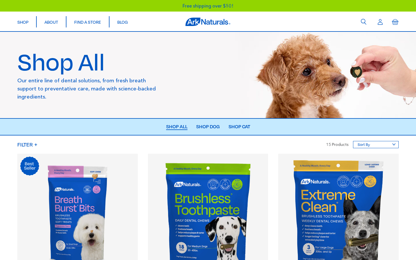
Collection pages (PLP — Product Listing Page) are the category and "shop" pages — they list multiple products with custom filters, sorting, and pagination.
Collection templates
Assigned in Shopify Admin → Products → Collections → (collection) → Theme template.
| Template | Section used | When to use it |
|---|---|---|
collection.json | main-collection-plp | Default — main custom PLP with hero, reviews badge, tabs, custom filters and a grid video tile |
collection.shop-cat.json | main-collection-plp | Variant with a different hero image (used for the cat-focused collection). No grid video. |
collection.v2.json | main-collection-2 | Alternative simplified layout |
Most collections use collection.json
The default template (main-collection-plp) is what's described on the rest of this page. Only assign a different template when a collection needs a noticeably different layout.
Main collection section (PLP)
Section file: main-collection-plp.liquidType in editor: PLP Collection
This is the section that drives the live collection pages. It has 4 parts: hero banner (title, reviews badge, description), category tabs, filter & sort bar, and the product grid (with an optional video tile).
Section settings
Listed in the order they appear in the customizer.
| Setting | ID | Type | Default | What it does |
|---|---|---|---|---|
| Hero Image (Desktop) | hero_image | Image picker | — | Background image for the top hero band on desktop. Loaded at 1600px. |
| Hero Image (Mobile) | hero_image_mobile | Image picker | — | Mobile background image. If empty, the desktop image is used. Loaded at 800px. |
| Product Grid Video | See Product grid video | |||
| Video | hero_video | Video | — | Optional video tile placed inside the product grid. Landscape 16:9 works best. |
| Grid row | grid_video_row | Range 1–8 | 1 | Desktop row the video sits in (3 products per row). Past the last row it shows after the products. |
| Width (products) | grid_video_columns | Select 2 / 3 | 2 | How many product columns the tile spans on desktop. |
| Autoplay | hero_video_autoplay | Checkbox | true | Only works while Mute is on. |
| Loop | hero_video_loop | Checkbox | true | |
| Mute | hero_video_muted | Checkbox | true | Unmuting turns autoplay off and shows player controls. |
| Hide video on mobile | hero_video_hide_mobile | Checkbox | false | Drops the tile from the grid on mobile. |
| Auto height | grid_video_height_auto | Checkbox | true | Tile height follows the video's aspect ratio; the three height settings below are ignored. |
| Video minimum height (desktop, 2 products wide) | hero_video_height | Range 200–900px | 400 | Floor only; a 2-column tile grows to the height of the product next to it. |
| Video height (desktop, full row) | grid_video_height_full | Range 200–900px | 500 | Fixed height when the tile spans 3 columns. |
| Video height (mobile) | hero_video_height_mobile | Range 200–700px | 300 | Mobile minimum height (when Auto height is off). |
| Hero overlay color | hero_overlay_color | Color | #000000 | Tint over the hero image. |
| Hero overlay opacity | hero_overlay_opacity | Range 0–80% | 0 | 0 = no overlay. Raise it if the heading is hard to read over the hero image. |
| Reviews badge | See Reviews badge | |||
| Show reviews badge | show_reviews_badge | Checkbox | true | Stars + "N reviews across all platforms" under the hero title. |
| Rating | reviews_badge_rating_mode | Select auto / manual | auto | Automatic = weighted average of this collection's products. |
| Manual rating | reviews_badge_rating | Range 0–5 (0.1) | 4.8 | Only used when Rating = Manual. |
| Fallback badge text | reviews_badge_text | Text | (empty) | Shown when no totals could be calculated, e.g. "Loved by 10,000+ pets". |
| Fallback Description | description | Textarea | Our entire line of dental solutions… | Shown in the hero only when the collection itself has no description set. |
| Category Tabs Menu | tab_menu | Link list | — | Fallback navigation menu (used only when no Collection Tab blocks are added). |
| Size Filters | size_filters | Text | Mini,Small,Medium,Large,Extra Large | Comma-separated values for the "By Size" filter pills. See Custom filters below. |
| Need Filters | need_filters | Text | Clean & Freshen,Advanced Care | Comma-separated values for the "By Need" filter pills. See Custom filters below. |
Current values on collection.json: video Overview landscape - 15 sec .mp4, grid row 2, width 2, autoplay/loop/mute on, auto height on, reviews badge on (automatic), overlay off. The section's Custom CSS adds .plp-grid-video {margin: auto 0;} to center the tile vertically in its row. collection.shop-cat.json has no video and doesn't save the reviews-badge keys, so the schema defaults apply there (badge on, automatic).
Hero title
The big page title comes from the collection's title (or the active tab title — see below). It's not editable from this section.
Reviews badge
Rendered by snippets/reviews-aggregate-badge.liquid under the hero title, e.g. ★★★★★ 26,860 reviews across all platforms.
How the copy and stars are worked out:
- If the collection has a
custom.reviews_badgemetafield, that text is used as-is. With Rating = Automatic the stars are still calculated. - Otherwise the theme totals the reviews of the collection being viewed (up to 250 products; falls back to
collections.allwhen there's no collection). Each product contributes its blended figures when it has off-site reviews, otherwise its Junip figures (see Integrations → Blended reviews). - The rating is a weighted average: a product with 13,000 reviews counts for more than one with 3. The star row fills proportionally.
- The copy is "N reviews across all platforms" when at least one product contributed blended figures, otherwise "N reviews".
- If nothing could be calculated, Fallback badge text is shown. If that's empty too, the badge is hidden.
Only on page 1
The calculation runs inside a paginate loop. On ?page=2 and later it comes back empty, so the badge shows the fallback text (or nothing). A collection with more than 250 products under-reports.
Product grid video
The video is a tile inside the product grid. The hero above the grid is always image + copy.
- The tile is inserted before the first product of Grid row (row 2 = after 3 products). The count ignores products hidden with
plp-hidden. If the row is past the end of the grid, the tile is shown last. - It spans 2 or 3 product columns on desktop. On mobile the grid is one column and the tile uses its own height.
- The tile only appears on page 1 of a collection.
- Only the MP4 sources Shopify generates are used. The HLS stream is skipped, because Chrome and Firefox can't play it.
- Autoplay requires Mute. A small script retries
play()for browsers that ignore theautoplayattribute. The video's preview image is used as the poster.
Category Tabs (blocks)
The horizontal tab bar under the hero (e.g. SHOP ALL · SHOP DOG · SHOP CAT) is built from Collection Tab blocks. Each block is one tab.
Add or reorder them in Customize → (collection page) → PLP Collection → Add block → Collection Tab.
Block settings — collection_tab
| Setting | ID | Type | What it does |
|---|---|---|---|
| Collection | collection | Collection picker | The collection this tab links to. Use this for any tab pointing at a real Shopify collection. |
| Custom URL | url | URL | Used only when no collection is selected. Lets you point a tab at any URL (e.g. /collections/all, a page, or an external site). |
| Tab Title | title | Text | What the tab says. Leave blank to use the collection's title. |
Currently configured tabs
| Order | Title | Target |
|---|---|---|
| 1 | SHOP ALL | Custom URL → collection shop-all on collection.json; /collections/all on collection.shop-cat.json |
| 2 | SHOP DOG | Collection shop-all-dogs |
| 3 | SHOP CAT | Collection shop-all-cat |
Why shop-all instead of /collections/all
/collections/all is Shopify's automatic all-products collection, and its order can't be curated. The SHOP ALL tab points at the regular shop-all collection, so its product order can be set by hand (Sort = Manual). To re-rank "Shop All", set that collection's Sort to Manual and drag products in Products → Collections → Shop All.
Same tab bar on every collection
Because the tabs live in the section settings, they're shared across every collection that uses this section. If you add a fourth tab, it appears on shop-all-dogs, shop-all-cat, and every other collection that uses collection.json. The currently-viewed collection is auto-highlighted as "active".
Fallback menu (tab_menu)
The "Category Tabs Menu" setting is only used when no Collection Tab blocks exist. In practice the live site always uses blocks — leave the menu blank.
Custom filters
The filter pills under the tabs are fully custom, not Shopify's native Search & Discovery filters. They're powered by the <collection-filter> Vue component and work like this:
- The filter values (the labels of the pills) are written in the section settings as comma-separated text.
- Products are matched against pills by their Shopify product tags.
- A product is shown when its tags include the selected filter value (case-insensitive match).
- Filtering happens on the client (in the browser) — no page reload.
Two filter groups
| Group | Section setting | Label on the page |
|---|---|---|
| Size | size_filters | By Size: |
| Need | need_filters | By Need: |
How to add or rename a filter pill
Open Customize → (collection page) → PLP Collection.
Edit either Size Filters or Need Filters.
Add the new value to the comma-separated list. Order matters — it's the order pills are displayed in.
Example:
Mini,Small,Medium,Large,Extra Large,GiantSave — the new pill appears on the page.
How to tag a product so it shows under a filter
This is the part that requires editing each product (not the theme).
- Open Shopify Admin → Products → (product).
- In the Tags field, add a tag that exactly matches the filter value (case-insensitive, but spaces and punctuation must match).
- Save. The product now shows when that filter pill is selected.
| Filter pill | Tag the product must have |
|---|---|
Mini | Mini (or mini) |
Clean & Freshen | Clean & Freshen (or clean & freshen) |
Advanced Care | Advanced Care (or advanced care) |
Tag spelling must match the pill exactly
The Vue component does a tags.includes(value.toLowerCase()) check. That means Mini and mini both work, but Mini Dogs will not match a filter pill named Mini. If you rename a filter, you also need to update the tags on every product, or the products will disappear from that pill.
Smart pill behaviour (no dead clicks)
The filter is built so customers can't click a pill that would return zero products. The component automatically:
- Hides pills that have no matching products in the current collection. If no product in the cat collection is tagged
Extra Large, the "Extra Large" pill simply doesn't render on that page. - Hides pills that would conflict with the current selection. When the user picks
Small, the other size pills (Mini,Medium, …) collapse — they can clearSmallfirst and pick something else. - Keeps cross-group pills visible. Picking a Size doesn't hide the Need pills, so users can combine filters across groups.
Single-select within a group
Inside a single group (Size or Need), only one pill can be active at a time. Clicking a different value replaces the current one. Clicking the same value again clears it. The combination across groups uses AND logic (e.g. Size = Small AND Need = Clean & Freshen).
Product count updates live
The "X Products" counter to the right of the Filter button updates as filters are applied — it's the count of visible cards after filtering, not the total in the collection.
With no filter active, the number is the collection's product count minus the products tagged plp-hidden, so it matches the tiles actually shown. The subtraction is exact for collections up to 50 products; above that it may over-count slightly.
Filters and collapsed size families
A family tile (see below) answers for the whole family. Its data-tags contain:
- its own tags,
- the tags of every sibling in
custom.selector_skus, - each sibling's size label (
custom.selector_title, or the part after the colon incustom.selector_type) in both spellings viahelper-size-aliases.liquid:XS↔Extra Small↔Mini,S↔Small,M↔Medium,L↔Large,XL↔Extra Large,OS↔One Size.
So a family with a Medium sibling shows under By Size: Medium even if that sibling isn't tagged Medium. When a Size pill is active, each card also switches to that size: the matching variant, or, for a family tile, the matching sibling product. Clearing the filter restores the card's original product and variant.
Sort dropdown
The Sort By dropdown next to the product count is the only native Shopify part of the bar. It uses the collection's standard sort options:
- Featured
- Best selling
- Alphabetically, A–Z / Z–A
- Price, low to high / high to low
- Date, old to new / new to old
Editable in Shopify Admin → Products → Collections → (collection) → Sort — the available options here also drive which ones appear in the dropdown.
When the user picks a sort option, the page navigates to ?sort_by=<option> and Shopify re-renders the products in the new order. (This does reload the page, unlike the filters.)
Product card on PLP
Each card is rendered by the snippet layout-product-plp.liquid (Vue PlpProductCard) and shows:
- Product image, swapping to the selected variant's image (hover image =
custom.rollover_image, else the 2nd product image) - Best Seller badge, when
custom.best_selleris true - Rating line: average + stars + short count, e.g.
4.4 ★★★★☆ (2.3k). Uses the blended cross-platform figures when the product has off-site reviews, else Junip. With no reviews: a "Write a review" link. See Integrations → Blended reviews. - Title:
custom.display_titleif set, else the product title - One-liner from
custom.one_liner(falls back to the first 15 words of the description) - Price + compare-at price
- Size pills: the product's own first option (variants)
- Linked-product row: when
custom.selector_skusis set (flavor swatches or size pills; the product is injected into its own row and sizes are sorted XS → OS) - Add button, or Find Store (links to
/pages/store-locator) when the selected variant is sold out
Sold-out handling: sold-out size pills and sold-out linked products are greyed out and can't be clicked. The card opens on an in-stock variant: custom.variant_default_order first, then Medium, then Large, then the first available (helper-default-variant.liquid). Find Store therefore only shows when nothing is in stock.
Each card also carries a data-tags attribute that lists the product's Shopify tags (plus family tags, see above) — this is what the custom filters read to decide whether to show or hide the card.
See Product Pages → Metafields for the full list of metafields driving the card.
Collapsed size families (plp-hidden)
Some lines sell each size as a separate product linked through custom.selector_skus (e.g. XS · S · M · L). To show such a family as a single tile, one product represents the family and the others are hidden from the grid:
- Pick the product that should represent the family on the PLP.
- Tag every other sibling with
plp-hidden. The match is case-insensitive and whole-tag:PLP-Hiddenworks,plp-hidden-legacydoesn't. - Optionally set
custom.display_titleon the representative product (e.g. "Brushless Toothpaste" instead of "Brushless Toothpaste — Medium"), so the tile reads as the family name. See Product Pages → Display title.
What changes, and what doesn't:
Hidden sibling (plp-hidden) | |
|---|---|
| PLP grid tile | Not rendered (helper-plp-hidden.liquid) |
| Reachable from the PLP | Yes: through the size pills of the family tile, which come from selector_skus |
| Product count in the filter bar | Not counted |
| PDP, search results, direct links | Unchanged: still published and searchable |
| Filters | The family tile carries the sibling's tags and size aliases, see Filters and collapsed size families |
A page made up entirely of hidden products shows the "no products" empty state instead of an empty grid.
Pagination
The grid paginates at 24 products per page (hardcoded in main-collection-plp.liquid). Pagination is server-side and uses the standard Shopify pagination URL parameter (?page=2).
Filters reset on page change
Because the custom filters run client-side on whichever products are currently rendered, they apply only to the products on the current page. If a collection has more than 24 products, filtering on page 1 won't pull in matching products from page 2. Keep collections that need rich filtering under 24 products, or rely on category tabs to split them.
Add-on sections
These sections can be added above or below the main collection section.
Banner
Section file: section-banner.liquid
A simple image banner with a headline, body text, and CTA button.
| Setting | ID | Type | Default |
|---|---|---|---|
| Background image | image | Image picker | — |
| Headline | headline | Text | Headline |
| Body text | text | Textarea | Lorem ipsum… |
| Button URL | button-url | URL | — |
| Button text | button-text | Text | Button |
Hero
Section file: section-hero.liquid
A more visual variant of Banner — full-width image with overlaid headline and CTA. Same fields as Banner.
Newsletter
Section file: section-newsletter.liquid
Headline + body + Klaviyo email form (uses the global Klaviyo list ID).
| Setting | ID | Type | Default |
|---|---|---|---|
| Headline | headline | Text | Our newsletter |
| Body | text | Textarea | Lorem ipsum… |
Shop
Section file: section-shop.liquid
Text + button CTA — a smaller "browse more" bar.
| Setting | ID | Type | Default |
|---|---|---|---|
| Description | text | Textarea | From our lineup of chews… |
| Button URL | button_url | URL | — |
| Button text | button_text | Text | Shop Now |
Quotes
Section file: section-quotes.liquid
Customer testimonial carousel (up to 3 blocks).
| Setting | ID | Type | Default |
|---|---|---|---|
| Headline | headline | Text | What others say about us |
Blocks (max 3): quote — quote-text (textarea), quote-author (text).
All-collections listing page
Template: list-collections.jsonSection file: main-list-collections.liquid
The page that lists every collection (e.g. /collections). Each collection is rendered as a card with its image, title and product count.
Search results page
Template: search.jsonSection file: main-search.liquid
Uses native Shopify search (no Algolia). No section settings. The page has a search box and then two groups:
| Group | Heading (locale key) | Rendered with |
|---|---|---|
| Products | "Products" (search.products) | The same PLP card as collections (layout-product-plp.liquid) in a 3-column grid |
| Articles | "Articles" (search.articles) | Blog cards (layout-blog-article.liquid) |
A group is hidden when it has no hits. A "N results for …" line sits above the groups. Results are paginated 24 per page, products and articles together, in Shopify's relevance order. There are no custom filters on this page.
The header's live search dropdown also shows Products and Articles, see Layout Sections → Search dropdown.
Blog and articles
Blog listing
Template: blog.json · Section: main-blog.liquid (Blog)
- Title: the blog title, with the first two words in brand blue.
- Tag pills: an "All Stories" pill plus up to 10 tag pills. Clicking a tag goes to
/blogs/<blog>/tagged/<tag>, and the active tag moves to the front. Shows "X / Y posts" on the right. - 2-column grid of article cards, 8 posts per page.
| Setting | ID | Type | What it does |
|---|---|---|---|
| Featured tags (comma separated) | featured_tags | Text | Leave empty to auto-rank the top 10 tags by post count. Set a comma-separated list to show exactly those tags in that order. |
Article page
Template: article.json · Section: main-article.liquid (no settings)
Shows the first tag as an eyebrow, the article, and 3 related posts from the same blog (the latest posts other than the current one) with their first tag and publish date.
Common content manager tasks
Add a new size or need filter
- Customize → (any collection page) → PLP Collection → Size Filters (or Need Filters).
- Append the new value to the comma-separated list (e.g.
Mini,Small,Medium,Large,Extra Large,Giant). - Save.
- Shopify Admin → Products — tag every product that fits the new filter with the exact same text (case-insensitive).
- The pill appears automatically on every collection where at least one product carries the tag.
Rename a filter pill
- Edit the value inside Size Filters or Need Filters (e.g. change
Mini→Toy). - Update every product tag from the old name to the new one — otherwise those products will disappear from the renamed pill.
Remove a filter pill entirely
Delete the value from the comma-separated list. (You can leave the tags on the products in case you want to bring the pill back later — they have no other effect.)
Add a new category tab
- Customize → (collection page) → PLP Collection → Add block → Collection Tab.
- Pick the collection and (optionally) a custom title.
- Drag to reorder.
The new tab appears on every collection that uses this section.
Change the hero image for one specific collection only
- Create a custom template (e.g.
collection.shop-cat.jsonalready exists for the cat collection). - Assign that template to the collection in Shopify Admin → Products → Collections → (collection) → Theme template.
- Open that template in the customizer and set a different hero image — other collections are unaffected.
Reorder products inside a collection
Set the collection's Sort to "Manual" in Shopify Admin → Products → Collections → (collection), then drag products into the desired order. The PLP picks up the new order on the next load.
Change products per page
The 24-per-page limit is hardcoded in main-collection-plp.liquid ({%- paginate collection.products by 24 -%}). Changing it requires a developer update — and remember that the custom filters only operate on the current page's products.
Show a size family as one tile
Tag every sibling except the representative product with plp-hidden, and (optionally) set custom.display_title on the representative. All siblings must be listed in each other's custom.selector_skus so they appear as size pills. See Collapsed size families.
Swap or move the grid video
Customize → (collection page) → PLP Collection → Product Grid Video. Pick a new Video, change Grid row to move it up or down, or set Width to 3 products (full row). Clear the Video field to remove the tile.
Change the reviews line under a collection title
- One collection only: fill that collection's
custom.reviews_badgemetafield (Products → Collections → (collection) → Metafields). The text replaces the calculated copy; stars stay automatic. - Every collection on the template: set Rating to Manual to pin the star value, or untick Show reviews badge to hide the line. Fallback badge text only appears when no totals could be calculated (e.g. on page 2).