
Layout Sections
The three sections in this category render on every page of the site: the announcement bar at the top, the main header, and the footer. They're configured in Customize → Sections (the Header and Footer groups) — not in Theme settings.
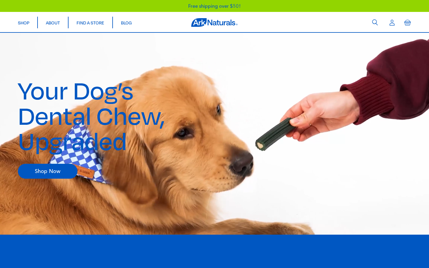
Announcement Bar
Section file: layout-announcement-bar.liquidType in editor: Announcement Bar
The thin bar above the header used for shipping promos, sale messages, or sitewide announcements. Rotates if more than one message block is added.
Section settings
| Setting | ID | Type | Default | What it does |
|---|---|---|---|---|
| Show announcement bar | visible | Checkbox | false | Master on/off switch. |
| Show only on home page | home_page_only | Checkbox | true | When on, the bar appears only on the homepage. Turn off to show site-wide. |
| Autoplay (ms) | autoplay | Number | 5000 | Time between slides in milliseconds. Set to 0 to disable auto-rotation. |
| Fallback content | content | HTML | Free shipping over $50! | Single message used when no announcement blocks are added. |
Current values (config/settings_data.json): Show announcement bar = on, Show only on home page = off (so the bar is site-wide), autoplay 5000, content Free shipping over $50!.
Blocks (max 5)
When you add Announcement blocks, the bar becomes a carousel of those blocks and the Fallback content is ignored.
| Block setting | Type | Purpose |
|---|---|---|
| Content | Rich text | The announcement message |
| Link | URL | Optional URL the whole bar links to |
Content manager checklist
- Decide whether the message needs to appear site-wide or only on the homepage.
- For a single recurring message, leave blocks empty and use Fallback content.
- For multiple rotating messages, add an Announcement block per message.
- Keep messages short — anything over ~70 characters wraps awkwardly on mobile.
Header
Section file: layout-header.liquidType in editor: Header
The sticky top bar with the logo, main navigation, search, account, and cart icons.
Section settings
| Setting | ID | Type | Default | What it does |
|---|---|---|---|---|
| Menu | menu | Link list | main-menu | The Shopify menu used for the main navigation. Edit the menu in Navigation → Menus. |
| Fixed (sticky) | fixed | Checkbox | true | Keep the header pinned to the top while scrolling. |
| Show search | show_search | Checkbox | true | Display the search icon in the header. It opens a search dropdown with live suggestions (see below). |
| Show login | show_login | Checkbox | true | Display the account icon — clicking it goes to the customer account page (or /pages/account-login if logged out). |
| Show cart | show_cart | Checkbox | true | Display the cart icon — clicking it opens the cart drawer. |
Current configuration
Menu: main-menu
Fixed: true
Show search: true
Show login: true
Show cart: true
Logo
The header logo is set in Theme settings → Header → Logo, not in this section.
Search dropdown
The search icon mounts the Search Vue component. Suggestions start once the query is 4+ characters long and come from Shopify's Predictive Search API (/search/suggest.json):
- Products: up to 5, each with image, title and price.
- Articles: up to 5 blog posts, each with image and title.
- A "view all" link goes to
/search?q=…. That page lists Products and Articles separately, see Collection Pages → Search results page.
There are no settings for the dropdown. Which results come back depends on Shopify's search (Search & Discovery app for synonyms and boosts).
Tablet layout
The main navigation links use tighter horizontal padding below the xl breakpoint (1280px), so the full menu fits on one line on tablets.
Navigation menus are edited elsewhere
Adding or removing menu links is done in Shopify Admin → Online Store → Navigation → Menus, not the customizer. The Header section only controls which menu is displayed.
Footer
Section file: layout-footer.liquidType in editor: Footer
The footer block at the bottom of every page. Contains the logo, contact info, two menus, social icons, and the copyright line.
Section settings
Brand & contact info
| Setting | ID | Type | Current value | What it does |
|---|---|---|---|---|
| Logo | logo | Image picker | Layer_3.svg | Footer-specific logo (can differ from header logo). |
| Shop name | show_name | Text | (empty) | Displayed above the address. |
| Address | address | Text | (empty) | Business mailing address. |
| Phone display text | url1_text | Text | (empty) | Visible phone number (e.g. "858-486-6500"). |
| Phone link | url_phone | URL | (empty) | The actual link (use a tel: URI). |
| Contact link text | url2_text | Text | Contact Us | Label for the secondary link. |
| Contact link URL | url2 | URL | https://antelopepets.gorgias.help/en-US/contact | Help center / contact form URL. |
Menus
| Setting | ID | Type | Current value |
|---|---|---|---|
| Center menu | menu_center | Link list | footer |
| Right menu | menu_right | Link list | footer-resources |
Edit the menu items in Navigation → Menus. The right menu renders under the Resources heading. On the live site it holds: Customer Service · Privacy and Terms · Careers · Donation Requests · Satisfaction Guarantee · Accessibility.
Accessibility settings drawer
| Setting | ID | Type | Default | What it does |
|---|---|---|---|---|
| Show accessibility settings in Resources | accessibility_enabled | Checkbox | true | Master switch for the drawer trigger in the Resources column. |
| Accessibility link text | accessibility_text | Text | Accessibility | Label of the trigger. Also used to find the menu link to take over (see below). |
| Accessibility statement URL | accessibility_statement_url | URL | (empty) | Target of the Accessibility Statement button inside the drawer. Only used when the replaced menu link has no URL of its own. Leave empty to hide the button. |
These keys aren't saved in settings_data.json, so the defaults above apply.
How the trigger is placed (sections/layout-footer.liquid → snippets/accessibility-toggle.liquid):
- If a link in the Resources menu (
menu_right) has the same handle as the link text (e.g. a menu item titled "Accessibility"), that link turns into the drawer button. Its URL becomes the drawer's Accessibility Statement button. On the live site that URL ishttps://www.antelopepets.com/pages/accessibility. - If no menu link matches, an extra "Accessibility" item is appended to the end of the Resources list. It uses Accessibility statement URL for the statement button.
What visitors can switch on (the Accessibility Vue component, a slide-out drawer):
| Option | Effect |
|---|---|
| Increase Text Size | Cycles 100% → 110% → 125% root font size |
| High Contrast Mode | Cycles off → 50% → 150% contrast (applied through a fixed backdrop layer, so sticky/fixed elements keep working) |
| Dyslexia-Friendly Font | Switches the page to the self-hosted OpenDyslexic font |
| Reduce Animations | Turns off CSS animations, transitions and smooth scrolling site-wide |
| Highlight Keyboard Focus | Draws a 3px blue outline around the focused element |
Choices are stored in the visitor's browser (localStorage key acc-settings) and re-applied on every page. On a first visit the drawer follows the OS preferences prefers-contrast and prefers-reduced-motion. Reset Settings clears everything. Esc closes the drawer.
Rename or move the trigger
To rename it, change the menu item's title and Accessibility link text to the same words (e.g. "Accessibility Options"). The match is by handle, so the two must agree. To point the statement button somewhere else, change the menu item's URL.
Social icons
Each social icon has a visibility toggle and a URL. Hide an icon entirely by turning the visibility off.
| Network | Visibility ID | URL ID | Current URL |
|---|---|---|---|
social_instagram_visible | social_instagram_link | https://www.instagram.com/arknaturals/ | |
social_facebook_visible | social_facebook_link | https://www.facebook.com/arknaturals/ | |
| YouTube | social_youtube_visible | social_youtube_link | https://www.youtube.com/@arknaturals |
Per-section vs. global social URLs
The footer section uses its own social URLs — these override the URLs set in Theme settings → Social Media. The global ones are fallbacks for any other surface (JSON-LD, future sections) that needs them.
Copyright
| Setting | ID | Type | Current value |
|---|---|---|---|
| Copyright | copyright | Text | Ark Naturals |
The current year is automatically prepended at render time.
Newsletter form
The footer also contains a Klaviyo newsletter signup form that posts directly to the Klaviyo list ID set in Theme settings → Klaviyo Email List. There is no per-section toggle — the form is always present in the footer.