
Product Pages
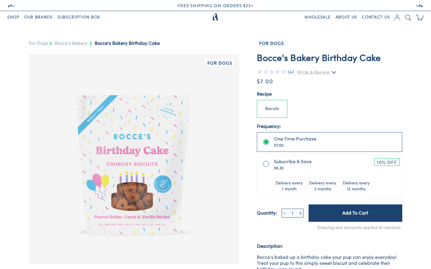
Overview
Product pages are configured through Theme Customizer > Products by selecting the appropriate template. The theme has multiple product templates for different brands, each sharing the same main-product.liquid section but with brand-specific supplemental sections and FAQs.
Available Product Templates
| Template | File | Used For |
|---|---|---|
| Default | product.json | Generic Antelope products, bundles |
| Bocce's Product | product.bocces-product.json | Bocce's Bakery products |
| Bocce's Spa | product.bocces-spa.json | Bocce's grooming/spa products -- same as Bocce's Product but with the PDP Slide disabled |
| Ark Product | product.ark-product.json | Ark Naturals products |
| Super Snouts Product | product.super-snouts-product.json | Super Snouts products |
| Halloween Product | product.halloween-product.json | Seasonal Halloween products (adds section-code-animation above the main section, PDP Slide disabled) |
| Stash Product | product.stash-product.json | Stash products |
| ReCharge Bundle | product.recharge-bundle.json | ReCharge bundle builder (app block recharge-bundles-widget) |
| Test group (Bocce's) | product.testgroup_bocces-product.json | Test variant of the Bocce's template (FAQ, recommendations and Follow Us disabled) |
To assign a template to a product: Shopify Admin > Products > [Product] > Theme template (right sidebar)
Main Product Section
Section file: sections/main-product.liquid
The primary PDP section. Renders in a 12-column grid: images (7 cols) and product details (5 cols).
Section Settings
| Setting | ID | Type | Default | Description |
|---|---|---|---|---|
| Show dynamic recommendations | show_product_recommendations | Checkbox | true | Enable the cross-sell section |
| Heading | upsale_heading | Text | "Goes really Well With" | Cross-sell section heading |
| Products | product_list | Product list (limit 5) | -- | Fallback cross-sell products |
Product Image Gallery
- Mobile: Uses
<pdpmobileslider>Vue component with swipeable image carousel - Desktop: Uses
<pdp-image>Vue component with scrollable image grid and video support - Images are prepared by the
helper-pdp-imagessnippet - Videos are detected from
product.mediaand passed asvidandprev(preview) props - Pet flag badge (
product.metafields.custom.pet_flag) appears as an overlay on the top-right of the main image
Breadcrumbs
Renders above the image gallery:
- Pet type (from
product.metafields.custom.pet_flag) > Vendor > Product title - Each segment links to the appropriate page/collection
Product Details (Right Column)
- Pet Flag Badge -- Displayed above title on desktop if
product.metafields.custom.pet_flagis set - Product Title --
<h1>tag - Review Summary --
blended-reviewssnippet incompactmode (see Review Summary); clicking it smooth-scrolls to the Junip reviews widget. A "Write A Review" link opens Junip's review form - PDP Controller -- Vue
<pdp-controller>component (src/vue/components/PDP/index.vue) that handles:- Variant selection and price display
- One Time Purchase / Subscribe & Save selector and delivery frequency (see Subscription)
- Add to cart functionality and quantity controls
- FAQ accordion (variant-specific FAQs via
helper-pdp-faqssnippet) - Gift card image selection (if enabled, using images from Gift Cards theme settings)
Instant add to cart
"Add to cart" sends the product's title, variant, price (plan price for subscriptions), image and vendor along with the request, so the mini cart draws the new line immediately instead of waiting for /cart/add.js to return. See Cart & Checkout > Optimistic updates.
Cross-Sell Section ("Goes Really Well With")
Displays up to 3 recommended products below the product details:
- Primary source:
product.metafields.custom.goes_well_with_collection(collection metafield) - Fallback:
product_listfrom section settings - Each item shows: image, title, price, quantity controls (desktop), and "Add" button
- Uses
<pdp-card>Vue component for add-to-cart functionality
Subscription (Subscribe & Save)
The subscribe widget is part of <pdp-controller> and is driven by the product's native Shopify selling plans (product.selling_plan_groups, created by ReCharge). It renders whenever the product has at least one selling plan group:
- "One Time Purchase" vs "Subscribe & Save" options with the plan's discounted price
- Delivery frequency selector (one group with several plans, or several groups)
- Subscription details popup: a "Subscription details" link with a refresh icon under the selector; hovering (desktop) or tapping it shows a tooltip with the text from the theme setting below
| Setting | ID | Type | Current value |
|---|---|---|---|
| Subscription details popup text | subscription_details_text | Text | "No obligation, modify or cancel your subscription anytime on our portal." (default) |
Where to configure: Theme Settings > PDP Settings
Unused snippet
snippets/subscription-product.liquid (a ReCharge widget keyed off product.metafields.subscriptions.subscription_id) exists but is not rendered anywhere. Edit PDP/index.vue for subscribe-widget changes.
Attentive Dynamic Pricing
When product.metafields.custom.dynamic_discount is set, renders a #attn-inline-price-trigger div for Attentive's dynamic pricing feature.
Review Summary (Blended Reviews)
Snippets: snippets/blended-reviews.liquid, snippets/blended-junip-override.liquid
The PDP (and PLP cards / carousels) show a blended rating that combines on-site Junip reviews with Amazon and Chewy reviews. The numbers come from product metafields in the reviews namespace, written by an external daily sync.
| Metafield | Used for |
|---|---|
reviews.blended_rating | Star fill and the rating number |
reviews.blended_count | Review count |
reviews.sources | Decides blended vs Junip (e.g. site,chewy) |
reviews.amazon_reviews, reviews.amazon_url | "Read on Amazon" button (full mode) |
reviews.chewy_reviews, reviews.chewy_url | "View on Chewy" button (full mode) |
Decision rule: blended numbers are used only when reviews.sources contains amazon or chewy and rating and count are > 0. Otherwise the snippet silently falls back to the regular Junip summary (junip-product-summary) -- never a broken state.
blended-reviews render modes:
| Mode | Where | Look |
|---|---|---|
compact | PDP under the title | Rating + Junip-yellow stars + (count with commas) |
card | Product cards / sliders (layout-product) | Rating + green stars + (count in k-notation, e.g. 1.2k) |
full | Available for a PDP widget | Stars, "across all platforms", "N verified reviews", Amazon/Chewy buttons |
Junip widget override: blended-junip-override is rendered once from main-product.liquid, so it applies to every PDP template. When Junip injects its review widget client-side, the script replaces the widget's average, star fill and "N Reviews" count with the blended values and hides the per-star distribution bars (they can't be derived from an average).
Blended Review Widget Section
Section file: sections/section-blended-review-widget.liquid (name: "Blended Review Widget", category Custom, no settings)
An optional Theme Editor entry point that renders blended-junip-override. It isn't placed in any template -- the override already runs from main-product and a window-level guard prevents a double run.
Unused Vue prototype
src/vue/components/BlendedReviewWidget/index.vue (blended-review-widget) is a static prototype with hard-coded numbers. It is registered but not used by any template.
PDP Slide Section
Section file: sections/section-pdp-slide.liquid
A "Why you'll love this product" content section with image and text. Uses slide blocks.
Block Settings (Slide)
| Setting | ID | Type | Description |
|---|---|---|---|
| Image | image | Image picker | Desktop illustration |
| Mobile Image | imageM | Image picker | Mobile illustration |
| Headline | headline | Rich text | Section heading |
| Caption | caption | Rich text | Optional caption |
| Text | text | Rich text | Body content |
Each brand template configures this with brand-specific messaging:
- Bocce's: "recipes are made with all-natural fruits, vegetables, and meats right here in the USA"
- Ark Naturals: "products are made with your pet in mind -- no artificial flavors or colors"
- Super Snouts: "products are made with natural ingredients thoughtfully crafted in the USA"
PDP Reviews Section
Section file: sections/section-pdp-reviews.liquid
Displays product reviews powered by Junip. The section contains:
- A static/template review section (hidden by default,
class="hidden") - The live Junip widget via the
junip-product-reviewsnippet
Custom CSS overrides Junip's default styling to match the theme's navy color scheme. For products with Amazon/Chewy reviews, the widget's summary numbers are replaced with the blended ones (see above).
Settings
| Setting | ID | Type | Default |
|---|---|---|---|
| Headline | headline | Rich text | "Product Reviews" |
PDP Recommendations Section
Section file: sections/section-pdp-recommendations.liquid
A "You may also like" product carousel below reviews.
Settings
| Setting | ID | Type | Default |
|---|---|---|---|
| Show recommendations | show_product_recommendations | Checkbox | true |
| Heading | product_recommendations_heading | Text | "You may also like" |
| Products | product_list | Product list (limit 12) | -- |
Product source priority:
product.metafields.custom.ymal(metafield override) -- if setproduct_listfrom section settings -- fallback
Uses the <bestsellers> Vue component with helper-bestsellers snippet. Carousel cards show the blended rating when available (helper-bestsellers passes blended_rating, blended_count, sources), and the rating line is hidden on products with no reviews.
FAQ Section
Section file: sections/section-faq-content.liquid
Accordion-style FAQ section with question/answer blocks. Each brand template pre-populates brand-specific FAQs.
Settings
| Setting | ID | Type | Default |
|---|---|---|---|
| Headline | headline | Rich text | "FAQS" |
Block Settings (Text)
| Setting | ID | Type | Description |
|---|---|---|---|
| Question | headline | Text | FAQ question |
| Answer | content | Rich text | FAQ answer content |
Brand-specific FAQ examples:
- Bocce's: Storage, subscription delivery, treat quantities, expiration dates, organic ingredients
- Ark Naturals: Ingredient sourcing, formulation experts, cruelty-free testing, overconsumption guidance
- Super Snouts: Ingredient sourcing (USA), human-grade quality, vet approval, taste for picky eaters, shelf stability, affordable pricing
Brand-Specific Template Differences
All brand product templates share the same section types but configure them differently:
| Section | Default | Bocce's | Ark Naturals | Super Snouts |
|---|---|---|---|---|
| Main Product | Generic cross-sell | Bocce's cross-sell products | Ark cross-sell products | Snouts cross-sell products |
| PDP Slide | Generic messaging | Bocce's "all-natural" messaging | Ark "no artificial" messaging | Snouts "vet recommended" messaging |
| FAQ | Generic questions | Bocce's-specific FAQs (4 items) | Ark-specific FAQs (4 items) | Snouts-specific FAQs (6 items) |
| Recommendations | Generic "You may also like" | Bocce's + cross-brand picks | Ark + cross-brand picks | Snouts + cross-brand picks |
| Follow Us | Default Instagram feed | Default Instagram feed | Default Instagram feed | Default Instagram feed |
Section Order (brand templates, current)
- Main Product
- Help LA Fires (disabled)
- PDP Slide ("Why you'll love this product") -- disabled on
bocces-spaandhalloween-product - PDP Reviews (Junip)
- FAQ Content
- Recommended Products
- Follow Us (Instagram feed)
sections/section-ai-block.liquid (AI Product Insight) exists but is not placed on any product template.
PDP Optional Section
Section file: sections/section-pdp-optional.liquid
An optional additional content section that can be added to product templates for supplementary information.
Help LA Fires Section
Section file: sections/section-help-la-fires.liquid
A donation campaign section for LA fire relief, disabled on all product templates. Features card blocks with goals, messaging, and "Shop to Donate" CTAs.