
Homepage Sections
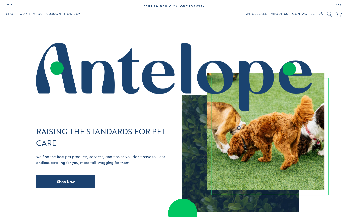
The homepage is defined in templates/index.json. Sections are configured in Theme Customizer > Home page.
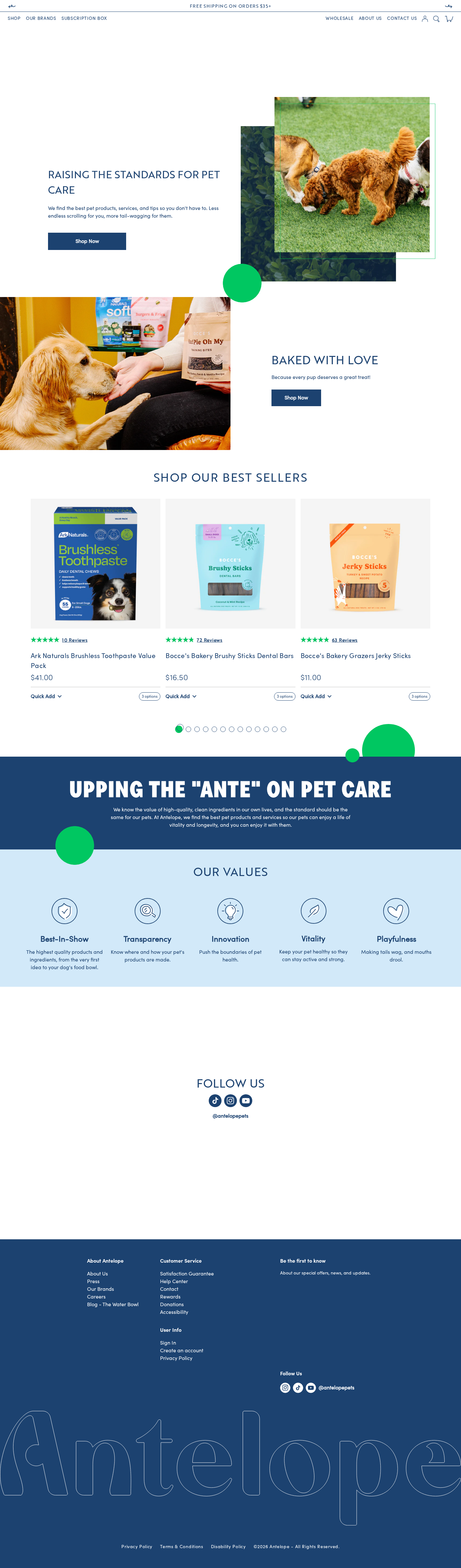
Current Homepage Section Order
On Theme A (live), index.json renders:
- Hero (
section-hero) -- "raising the standards for pet care" - Banner (
section-banner) -- "Set Your Pup's Starting Lineup" (football season) - Banner (
section-banner) -- "Halloween Recipes!" - Banner (
section-banner) -- "Bathtime Just Got an Upgrade" - Bestsellers (
main-bestsellers) -- "SHOP OUR BEST SELLERS" carousel from thehp-carouselcollection - Upping (
section-upping) -- "Upping the 'Ante' on pet care" content block - Mission/Values (
section-mission) -- "OUR VALUES" five-value grid (Best-In-Show, Transparency, Innovation, Vitality, Playfulness) - Spacer (
section-spacer) - Follow Us (
section-follow) -- Instagram feed
Disabled sections kept in the template for reuse: banners "Baked with love", "New: Holiday Treats!", "We are donating 15% of net proceeds to Wags & Walks", "SPECIAL TREATS AHEAD", plus Favorites, Brands, Main CTA, two spacers, Water Bowl and Newsletter.
Theme B homepage
Theme B's index.json differs in content only: its active banners are "Bathtime Just Got an Upgrade" and "Baked with love" (the Starting Lineup and "Treats Worth Tailgating For" banners are disabled, and it has an extra disabled "NEED IT SOONER?" banner). The section code is the same on both themes; banners are swapped seasonally in the Theme Customizer.
Hero Section
Section file: sections/section-hero.liquid
Full-width hero with a two-column layout: text content (left) and hero image (right, with the image appearing first on mobile).
Settings
| Setting | ID | Type | Description |
|---|---|---|---|
| Image (desktop) | imageBottom | Image picker | Main desktop hero image |
| Image (mobile) | imageTop | Image picker | Mobile hero image |
| Caption | caption | Rich text | Overlay text on the image (rendered in font-take_note script font) |
| Headline | headline | Rich text | Main heading in uppercase Brother font |
| Text | text | Rich text | Body text below headline |
| Button URL 1-3 | button-url, button-url1, button-url2 | URL | Up to 3 CTA button destinations |
| Button text 1-3 | button-text, button-text1, button-text2 | Text | Up to 3 CTA button labels |
| Show shop now button | is-shop-now-btn | Checkbox | Toggle between single "Shop Now" button or 3 individual buttons |
| Shop now URL | shop-now-url | URL | Single CTA destination |
| Shop now text | shop-now-text | Text | Single CTA label |
Current config: Single "Shop Now" button linking to the Shop All collection. Headline: "raising the standards for pet care".
Vue component: The hero renders an <antelope> Vue component for the animated logo on desktop.
Banner Section
Section file: sections/section-banner.liquid
A versatile two-column (50/50) layout with an image on one side and text content on the other. Used for seasonal promotions, campaigns, and announcements.
Settings
| Setting | ID | Type | Description |
|---|---|---|---|
| Image | image | Image picker | Desktop banner image |
| Mobile Image | image_mob | Image picker | Mobile-specific image |
| Headline | headline | Rich text | Banner heading |
| Text | text | Rich text | Banner description |
| Button URL | button-url | URL | CTA destination |
| Button text | button-text | Text | CTA label |
| Row reverse | swap | Checkbox | Swap image and text sides |
Multiple banner instances are used on the homepage for different campaigns. Disable/enable them seasonally in the Theme Customizer.
Bestsellers Section
Section file: sections/main-bestsellers.liquid
A product carousel that displays products from a selected collection. Uses the <bestsellers> Vue component with data from helper-bestsellers snippet.
Settings
| Setting | ID | Type | Description |
|---|---|---|---|
| Headline | headline | Rich text | Section heading |
| Collection | collection | Collection | Source collection for products |
Current config: Heading "SHOP OUR BEST SELLERS" pulling from the hp-carousel collection.
Ratings on carousel cards: helper-bestsellers also passes each product's blended review fields (reviews.blended_rating, reviews.blended_count, reviews.sources). Cards for products with Amazon/Chewy reviews show the blended rating and count (k-notation), others fall back to Junip. The rating line is invisible (but keeps its height) on products with no reviews, so carousel cards stay aligned. See Integrations > Blended Reviews.
Products PLP Section
Section file: sections/section-products-plp.liquid
A featured product section with an optional banner-style layout (image + text side-by-side) followed by a product carousel.
Settings
| Setting | ID | Type | Description |
|---|---|---|---|
| Headline | headline | Rich text | Section heading |
| Description | description | Rich text | Optional description text |
| Image banner | banner | Image picker | Side banner image |
| Mobile banner | banner_mob | Image picker | Mobile banner image |
| Swap image | swap | Checkbox | Reverse image/text order |
| Banner style | banner_style | Checkbox | Show banner alongside products (default: true) |
| Collection | collection | Collection | Product source collection |
Favorites Section
Section file: sections/section-favorites.liquid
A category image grid with clickable cards. Uses blocks for each category.
Block Settings (Image blocks)
| Setting | ID | Type | Description |
|---|---|---|---|
| Label | label | Text | Category name (e.g., "Shop Treats") |
| URL | url | URL | Category link destination |
| Image | image | Image picker | Category image |
Current config: Three categories (Shop Treats, Shop Supplements, Shop Dental), currently disabled.
Upping Section
Section file: sections/section-upping.liquid
A content block that displays the brand's mission statement or value proposition.
Settings
| Setting | ID | Type | Description |
|---|---|---|---|
| Headline | headline | Rich text | Main heading |
| Text | text | Rich text | Body content |
Current config: "Upping the 'Ante' on pet care" with a paragraph about high-quality ingredients.
Mission/Values Section
Section file: sections/section-mission.liquid
A multi-column values grid (typically 5 columns) with icon, heading, and description for each value.
Settings
For each of the 5 value columns (numbered 0-4):
| Setting | ID Pattern | Type | Description |
|---|---|---|---|
| Icon | colImage, colImage1-colImage4 | Image picker | Value icon/illustration |
| Heading | colHeading, colHeading1-colHeading4 | Text | Value name |
| Text | colText, colText1-colText4 | Text | Value description |
Current values: Best-In-Show, Transparency, Innovation, Vitality, Playfulness
Brands Section
Section file: sections/section-brands.liquid
A multi-brand showcase collage with scroll-based animation. Displays up to 5 brands in a masonry-style layout using the columns-2 CSS class. Uses ScrollMagic to pin the "MEET OUR BRANDS" heading while scrolling through brand cards.
Settings
| Setting | ID | Type | Description |
|---|---|---|---|
| Headline | headline | Text | Pinned heading text (default: "MEET OUR BRANDS") |
| Collection 1-5 | collection1-collection5 | Collection | Brand collections |
| URL 1-5 | url1-url5 | URL | Optional override URLs for each brand |
Each brand card shows:
- Brand logo from
collection.metafields.custom.brand_logo - Brand tagline from
collection.metafields.custom.brand_tagline - Collection image with hover overlay and "Learn More" link
- Optional custom URL override (falls back to collection URL, or
collection.metafields.custom.custom_urlif set)
Current config: Bocce's Bakery, Ark Naturals, Super Snouts, Doggo, My Perfect Pet. Currently disabled.
Follow Us Section
Section file: sections/section-follow.liquid
Renders an Instagram feed using the <instagramfeed> Vue component. Pulls the default Instagram token and nickname from theme settings.
Settings
No section-level settings -- everything is configured via Theme Settings > Instagram Settings (token, nickname) and shop.brand.metafields.social_links (Instagram, TikTok, YouTube URLs).
The component receives:
nikname-- fromsettings.niknamedtoken-- fromsettings.tokendefault- Social links from shop brand metafields
Newsletter Section
Section file: sections/section-newsletter.liquid
A centered email signup form using Shopify's native customer form with newsletter tag.
Settings
| Setting | ID | Type | Description |
|---|---|---|---|
| Headline | headline | Text | Section heading |
| Text | text | Textarea | Description text |
Currently disabled on the homepage (the footer newsletter handles email signups instead).
Other Homepage-Adjacent Sections
Main CTA (main-CTA.liquid)
Full-width call-to-action with desktop/mobile images and text. Used for "Not sure where to start?" bundle promotion. Currently disabled.
Water Bowl (main-water-bowl.liquid)
Blog promotion section: "Where pet parents go to obsess" with link to The Water Bowl blog. Currently disabled.
Spacer (section-spacer.liquid)
Empty spacing section for layout adjustments. No settings.