
Product Pages
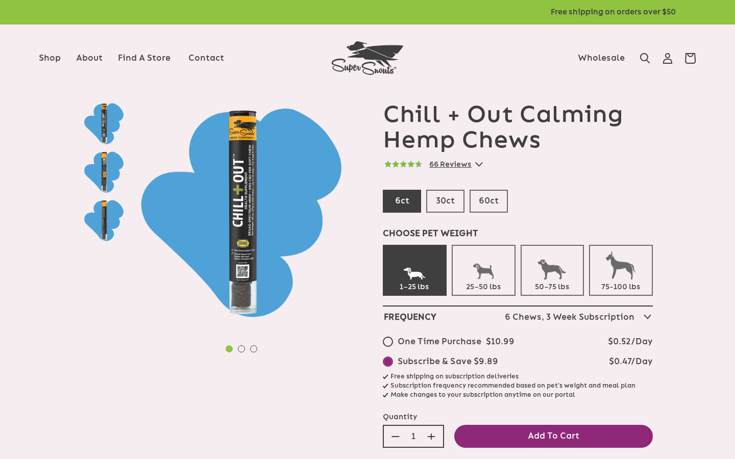
Product detail pages (PDPs) are powered by sections/main-product.liquid with three rendering variants. The variant is selected per-template through section settings checkboxes.
Main section file: sections/main-product.liquid
Shared PDP features:
- Flavor / type selector on PDP V2 and PDP Buttons, driven by product metafields. See Flavor / Type Selector.
- Blended review summary (site + Amazon + Chewy) under the title, falling back to the Junip summary. See Integrations → Blended Reviews.
- Secondary name line under the title from
custom.alternate_name. See Secondary Name. - Add to Cart is optimistic: the cart updates instantly and the "Item added" popup opens. See Cart & Checkout.
PDP Variants
Section Settings (main-product)
| Setting ID | Type | Label | Default |
|---|---|---|---|
version_pdp | checkbox | PDP V2 version | false |
version_pdp_buttons | checkbox | PDP Buttons | false |
title | text | Heading | "WHAT'S INSIDE?" |
cost_per_day | checkbox | Enable Price/Day | false |
Rendering Logic
{% if pdpv2 %}
  {% render 'product-pdp-v2' %}
{% elsif section.settings.version_pdp_buttons %}
  {% render 'product-pdp-buttons' %}
{% else %}
  {# Default PDP #}
{% endif %}
Template-to-Variant Mapping
| Template | PDP Variant | Cost/Day | Usage |
|---|---|---|---|
product.json | Default | No | Basic products, minimal layout |
product.pdpv2.json | PDP V2 | No | CBD products with full features |
product.pdpv2-nonhemp.json | PDP V2 | No | Non-hemp products |
product.pdp-buttons.json | PDP Buttons | Yes | Products with price-per-day calculator |
product.pdpv3-price-day.json | PDP V2 (version_pdp: true) | Yes | Price-per-day focused layout |
Default PDP
The default PDP renders directly in main-product.liquid without delegating to a snippet. It features:
- Image Gallery: Vue
<renderless-product-gallery>component with click-to-zoom. For single-variant products, shows up to 2 additional thumbnail images. - Product Title: Styled in
font-bionMat 45px, followed by the optional secondary name. - Review Summary:
{% render 'blended-reviews', product: product, mode: 'compact' %}-- blended rating and count (e.g.4.5 ★★★★★ (3,600)), falling back tosnippets/junip-product-summary.liquidwhen the product has no blended metafields. - Price Display: Current price with optional compare-at price, sale badge, and wholesale price class (
wsgProdPrice). - Sold Out State: The
.product-available/.sold-outclasses toggle visibility of the form vs. sold-out message. - Product Form: Standard
{% form 'product' %}withsnippets/product-form.liquid. - Description: Scrollable container (max-height 306px) with product description HTML.
PDP V2
Snippet file: snippets/product-pdp-v2.liquid
The enhanced PDP used for most CBD and supplement products.
Features
- Image Gallery: Vue
<pdp-gallery>component with images serialized viahelper-pdp-gallerysnippet. Eager-loaded featured image with LCP placeholder. - Title, secondary name and review summary: product title, the optional secondary name, and the blended review summary (
blended-reviews, compact mode). - Flavor / Type Selector:
{% render 'product-flavor-selector', product: product %}-- round icon buttons linking sibling products. See Flavor / Type Selector. - Variant Selector: Vue
<product-variants>component renders variant buttons/options. Receives:current-- Currently selected variant IDvariants-- Serialized variant data fromhelper-pdp-variantsdefault-- Default variant fromproduct.metafields.custom.default_variant_loading_on_pdp
- Product Form: With
pdpv2: trueflag, which changes the add-to-cart button styling to purple (!bg-pastelPinkL !text-white). - Sold Out State: Shows "In-Store Only" badge.
- Accordion Tabs: Three collapsible sections via Vue
<Accordion>component:- Description: Product description HTML
- Ingredients: From
product.metafields.custom.nutrition_ingredients - Recommended Use: From
product.metafields.custom.recommended_use
- COA Testing Link: If
product.metafields.custom.coa_testing_urlexists, displays a link to the Certificate of Analysis.
Product Metafields Used
| Metafield | Purpose |
|---|---|
custom.default_variant_loading_on_pdp | Default variant to display on page load |
custom.nutrition_ingredients | Ingredients content for accordion |
custom.recommended_use | Recommended use content for accordion |
custom.coa_testing_url | Link to Certificate of Analysis |
custom.disable_subscription | Hides subscription widget |
custom.calming_badge | Badge text on product cards |
custom.show_ingredients_section | Controls ingredients section visibility |
custom.ingredient_order | Custom ingredient display order |
custom.bars | Bars per pack (for calculator) |
custom.pounds_per_bar_daily | Pounds per bar daily (for calculator) |
custom.type_frequency | Subscription frequency type |
custom.enter_weight | Weight entry title text |
custom.alternate_name | Secondary name shown under the title (PDP + cards) |
custom.selector_skus | List of sibling products for the flavor/type selector |
custom.selector_type | "Heading: Label", e.g. "Flavor: Chicken" |
custom.selector_icon | Icon shown on this product's selector button |
custom.selector_color | Background color of the selected button |
reviews.blended_rating, reviews.blended_count, ... | Blended review data, see Integrations |
Flavor / Type Selector
Snippet: snippets/product-flavor-selector.liquidComponent: src/vue/components/FlavorSelector/index.vue
Links separate Shopify products that are "the same product in another flavor/type" (e.g. chews in chicken vs. peanut butter). It renders only when the product has custom.selector_skus.
| Metafield | Used for |
|---|---|
custom.selector_skus (product list) | The products shown as options, in order. Include the current product too. |
custom.selector_type | Text before the colon is the heading (taken from the current product), text after the colon is each option's label (taken from each referenced product). Example: Flavor: Chicken → heading "Flavor", label "Chicken". |
custom.selector_icon | Icon on each option (rendered at 48px on the PDP) |
custom.selector_color | Background of the active option (its icon turns white) |
Behavior:
- PDP (
mode="icon",navigate: true) -- 70px round icon buttons with the heading and the current label ("FLAVOR: Chicken"). Clicking another option fetches/products/HANDLE?section_id=..., swaps the product section HTML in place, re-mounts the Vue islands and updates the URL withhistory.pushState(falls back to a normal page load on error). - Quick Add popup (
mode="text") -- full-width text buttons; see Collection Pages → Quick Add popup. - Needs at least 2 options to render.
Rendered in snippets/product-pdp-v2.liquid and snippets/product-pdp-buttons.liquid (not on the default PDP).
Secondary Name (Alternate Name)
Snippet: snippets/product-alternate-name.liquid
A second title line showing the product's former name, from the custom.alternate_name product metafield. Renders nothing when empty.
- PDP (default, V2, Buttons): under the H1,
text-[41px](26px on mobile),font-bionR. - Product cards (PLP, carousels, search,
snippets/layout-product.liquid,snippets/layout-plp-default.liquid, Vue cards viaalternateNameinhelper-featured/helper-best-sellers): under the title; theflex-autospacing sits on the secondary line instead of the title, so card heights stay aligned.
PDP Buttons
Snippet file: snippets/product-pdp-buttons.liquid
Nearly identical to PDP V2 (including the flavor/type selector, secondary name and blended review summary) but with two differences:
- Cost Per Day Calculator: Passes
pdpbuttons: trueto the product form, enabling the price-per-day calculation feature. - Find Store / OSS Buttons: Instead of "In-Store Only" text, renders
<find-store-oss-btns />Vue component for the sold-out state, providing store locator and alternative purchase options.
Product Form
Snippet file: snippets/product-form.liquid
The shared product form component used across all PDP variants.
Parameters
| Parameter | Purpose |
|---|---|
id | Current variant ID |
product | Product object |
pdpv2 | Boolean for V2 styling |
pdpbuttons | Boolean for buttons variant |
calculator | Boolean for cost-per-day |
Components
- Results Component (
<results>): Handles subscription options and price-per-day calculator. Receives product price, bars/pack, pounds/bar, shipping cost, frequency type, subscribe text (settings.subscribe_text), and product configuration. - Quantity Selector (
<product-quantity>): Increment/decrement buttons with a text input. - Add to Cart (
<add-to-cart>): Receives:product-data(fromsnippets/helper-product-config.liquid) so it can build an optimistic cart line (title, variant, image, price) and show it in the cart immediately while/cart/add.jsruns. V2 variant uses full-width purple button.
The PDP renders no Shopify dynamic / accelerated checkout buttons (Shop Pay, Apple Pay, ...). Keep it that way -- see Cart & Checkout → Checkout Savings.
Subscription Integration
The <results> container is hidden (via .disable-subscription .results-container { display: none }) when the product has disable_subscription set to true. Additionally, the .disable-rc class is applied when cost_per_day is enabled.
PDP Template Sections
PDP V2 Template (product.pdpv2.json)
| Order | Section | Purpose |
|---|---|---|
| 1 | main-product (V2) | Core product display |
| 2 | section-why | Brand value props (Broad Spectrum, Non-Detectable THC, Grain Free, Water-Soluble) |
| 3 | section-ingredients | Ingredient slider driven by product tags |
| 4 | Junip app block | Full review widget (sortOrder: mostRecent) |
| -- | section-collection-title-text | "You May Also Like" (bestsellers) -- disabled |
| 5 | section-products | "You May Also Like" carousel (calming-anxiousness collection) |
PDP V2 Non-Hemp Template (product.pdpv2-nonhemp.json)
Same section order as PDP V2 but with the section-why block disabled. This removes the hemp-specific value props (Broad Spectrum, Non-Detectable THC, Water-Soluble Hemp) that are irrelevant for non-hemp products. The ingredients section and Junip reviews remain active.
PDP V3 Price/Day Template (product.pdpv3-price-day.json)
Same section order as PDP V2 but with cost_per_day: true enabled. This activates the price-per-day calculator in the product form, allowing customers to see the daily cost based on their pet's weight.
PDP Buttons Template (product.pdp-buttons.json)
Same section order as PDP V2 but with cost_per_day: true and version_pdp_buttons: true, plus the Blended Review Widget section (section-blended-review-widget) placed between section-ingredients and the Junip app block. It rewrites Junip's review summary with the blended totals ("N Reviews across all platforms") -- see Integrations → Blended Review Widget section.
Default Template (product.json)
| Order | Section | Purpose |
|---|---|---|
| 1 | main-product (Default) | Basic product display |
| 2 | Junip app block | Full review widget |
| 3 | section-collection-title-text | "You May Also Like" (bestsellers) |
sections/section-ai-block.liquid ("AI Product Insight -- See what AI knows about this product") exists in the theme but is not placed on any product template; it can be added in the theme editor.