
Collection Pages
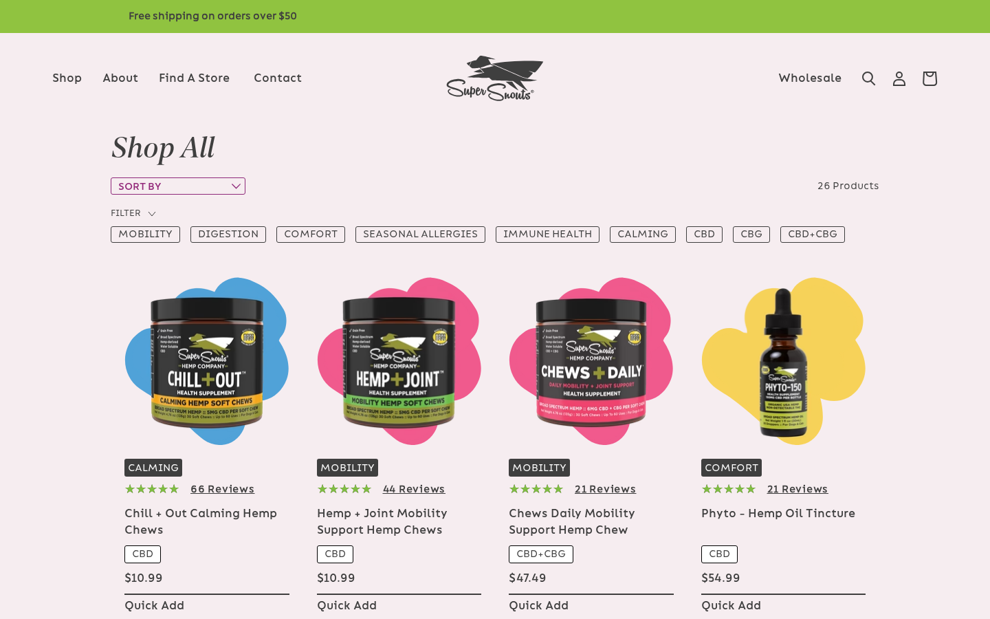
Collection pages (PLPs) are rendered by sections/main-collection.liquid, which delegates to one of two layout snippets based on a settings toggle.
Main section file: sections/main-collection.liquid
Layout Selection
{% if section.settings.v3_template %}
  {% render 'layout-plp-v3' %}
{% else %}
  {% render 'layout-plp-default' %}
{% endif %}
Section Settings
| Setting ID | Type | Label | Default |
|---|---|---|---|
count | checkbox | Count items | false |
carousel | checkbox | Carousel ON | true |
show_all_in_blocks | checkbox | Show all collections in the block | false |
ingredients | textarea | Key Ingredients filter | -- |
v3_template | checkbox | V3 template | false |
Block: Collection Info
Up to 10 blocks to define sub-collections displayed on the page:
| Setting ID | Type | Label | Default |
|---|---|---|---|
headline | richtext | Headline | "Stress & Anxiety" |
text | richtext | Description | "Available in Tinctures, Chews, and Peanut Butter Spread" |
collection | collection | Products (collection) | -- |
text_link | text | Text button | "See Our Full Line of Products" |
link | url | Url | -- |
Default PLP Layout
Snippet file: snippets/layout-plp-default.liquid
"Shop All" / Blocked Layout Mode
When the collection handle is shop-all, all, or show_all_in_blocks is enabled, the page renders in blocked mode:
- A page title ("Shop All") is displayed.
- An ingredient filter component (
<selects-filter>) appears at the top, populated from theingredientstextarea setting (e.g.,"CBD, CBD + CBG, Non-Hemp"). - Each collection block renders as its own subsection with:
- Headline and description text
- A
<collection-filter>Vue component with product cards - Carousel or grid display based on the
carouselsetting - Optional "See All" link
The first block also renders a static HTML product grid (4 items) as an LCP placeholder, which is replaced by the Vue component after hydration.
Single Collection Mode
For individual collections (not shop-all), the page renders:
- An empty
<selects-filter>(no ingredients filter) - The collection title
- A single
<collection-filter>component with all products from the collection
Vue Components
<selects-filter>: Dropdown/button filters for ingredient categories<collection-filter>: Product grid/carousel with filtering. Receives serialized product data fromhelper-featuredsnippet. Its cards' Quick Add opens the Quick Add popup.
The static LCP placeholder grid rendered in Liquid for the first block also shows the secondary name.
V3 PLP Layout
Snippet file: snippets/layout-plp-v3.liquid
An alternative layout that merges products from multiple sub-collection blocks into a single filterable grid.
Features
- Collection title displayed at the top.
<selects-filter>component with:show_filters: false(hides ingredient filters)collectionsdata serialized from blocks viahelper-filter-collections
- A single
<collection-filter>component rendering all products in a flex-wrap layout. - Products display with
white_badge: truefor a different badge style.
Collection Template Variants
Default Collection (collection.json)
Used for the main "Shop All" page. Configured with blocked mode displaying sub-collections:
| Sub-Collection | Handle | Products |
|---|---|---|
| Joint + Mobility | all-mobility | Chews and Powder |
| Calming + Anxiousness | calming-anxiousness | Chews, Powder, Tinctures |
| Everyday Comfort | comfort | Tinctures and Powder |
| Digestion + Urinary | all-digestion | Chews and Powder |
| Immune Support | immune-support | Chews and Powder |
| Allergies | all-allergies | Chews and Powder |
| Bones + Bully Sticks | non-cbd-chews | Sticks and Bones |
Settings: count: true, carousel: true, show_all_in_blocks: false.
Shop CBD Collection (collection.shop-cbd.json)
Filtered CBD product collections with ingredient filtering enabled.
| Sub-Collection | Handle |
|---|---|
| Joint + Mobility | mobility |
| Calming + Anxiousness | calming-anxiousness |
| Everyday Comfort | comfort |
| Allergies | allergies |
Settings: show_all_in_blocks: true, ingredients: "CBD, CBD + CBG, Non-Hemp".
The ingredient filter lets customers toggle between CBD, CBD + CBG, and Non-Hemp product lines within each health concern category.
Non-CBD Collection (collection.non-cbd.json)
Non-hemp/non-CBD product collections:
| Sub-Collection | Handle |
|---|---|
| Joint + Mobility | non-cbd-mobility |
| Digestion + Urinary | digestive-aid |
| Immune Support | non-cbd-immune-support |
| Allergies | non-cbd-allergies |
| Bones + Bully Sticks | non-cbd-chews |
Settings: show_all_in_blocks: true, no ingredient filters.
PDP V3 Collection (collection.pdp-v3.json)
Uses the V3 template layout (v3_template: true). Renders the layout-plp-v3.liquid snippet with sub-collection filtering via buttons.
| Sub-Collection | Handle |
|---|---|
| Shop All | all |
| Mobility | mobility |
| Digestion | all-digestion |
| Comfort | comfort |
| Seasonal Allergies | allergies |
| Immunity | immune-support |
| Calming | calming-anxiousness |
| CBD | all-cbd |
Settings: count: false, carousel: false, v3_template: trueIngredients filter: "Mobility,Digestion,Comfort,Allergy[Seasonal Allergies],Immunity[Immune Health], Calming,CBD,CBG, CBD+CBG"
The ingredients filter uses a bracket notation (e.g., Allergy[Seasonal Allergies]) to map filter labels to display names.
Product Card Data
Product cards across all PLP layouts are powered by the helper-featured snippet (and helper-best-sellers for carousels / cart upsells), which serializes product data for Vue components. Each product card displays:
- Product image (255px width)
- Calming badge from
product.metafields.custom.calming_badge - Rating -- blended rating and short count, e.g.
4.4 ★★★★☆ (3.6k)(see Blended Reviews) - Product title (linked)
- Secondary name from
custom.alternate_name, when set (see Secondary Name) - Price
- Quick Add -- variant buttons that open the Quick Add popup; sold-out products show the Find Store / OSS buttons instead
Serialized card fields used by the rating, secondary name and Quick Add popup:
| Field | Source | Used for |
|---|---|---|
blendedRating, blendedCount | reviews.blended_rating, reviews.blended_count | Card rating (skips the Junip API when present) |
alternateName | custom.alternate_name | Secondary name line |
description | product description (URL-encoded) | Popup "Description" tab |
nutrition | custom.nutrition_ingredients (URL-encoded) | Popup "Ingredients" tab |
selectorType, selectorSkus, selectorIcon, selectorColor | custom.selector_* | Popup flavor/type selector |
options, per-variant sellingPlans, rawPrice, displayPrice and weight metafields | variants / selling plans | Popup variant buttons, subscription widget and price-per-day calculator |
Quick Add Popup
Component: src/vue/components/ProductPopup/index.vueStore: src/vue/store/product-popup.js (Vuex module product-popup: isOpen, popupData, collectionData)
Picking a variant from a card's Quick Add button opens a modal where the buyer chooses one-time vs. subscription before adding to the cart.
Where it is used: every Vue product grid / carousel -- CollectionFilter (PLP and search results), CollectionProducts / collection-products-v2 (Section Products, "You May Also Like" on PDPs, Collection Praised, Collection Title Text), and CollectionProductsFind (homepage Best Sellers tabs). Each grid mounts a <product-popup>; only one instance opens at a time.
Popup contents:
| Left column | Right column |
|---|---|
| Product image (follows the selected variant), title, Junip/blended rating | Price (only when the variant has no selling plans) |
| Description / Ingredients tabs (hidden on mobile) | Flavor / type selector in text mode -- switching opens the sibling product in the same popup if it is in the current grid, otherwise goes to its PDP |
| Learn More link to the PDP | Option buttons (e.g. "Select Your Flavor", sizes); unavailable combinations are disabled |
<results> subscription widget (same as the PDP; price-per-day calculator when weight metafields exist; subscribe_text hidden) | |
| Quantity stepper and Add to Cart |
Add to Cart sends the selected variant, quantity and selling plan through the optimistic cart (cart/addItem) and closes the popup; the "Item added" popup then opens under the header. Escape or clicking the backdrop closes the modal.
Search Results Page
Section file: sections/main-search.liquid (templates/search.json)
The results page lists products and blog posts:
- Search form (
q), then a sort bar with the total number of results. - Products -- rendered with
<collection-filter>(same cards as the PLP, including Quick Add). Products taggedinternal_onlyare excluded from both the list and the count. - Articles -- matching blog posts rendered with
snippets/layout-blog-article.liquidin a 2-column grid. - "No results" when nothing matches.
Locale strings: search.products ("Products") and search.articles ("Articles"). The header dropdown search is described in Layout Sections → Header Search.