
Homepage Sections
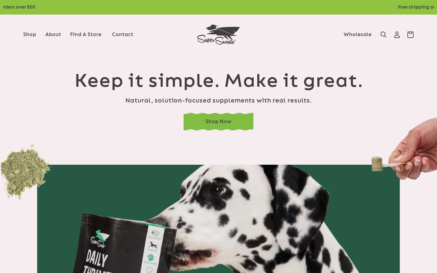
The homepage is defined in templates/index.json and uses a curated sequence of sections. The active sections in the current homepage order are:
- Section Main Animation -- Hero with GSAP scroll animation
- Section Best Sellers -- Tabbed product collections by health concern
- Section Why -- Why Super Snouts value propositions
- Section Marketing -- Featured product promotion (Daily Thrive)
- Section Why CBD -- CBD benefits grid with central image (8 blocks)
- Section Reviews -- Customer testimonial slider
Several additional sections are included but disabled in the template JSON: a second Section Main Animation, a Section Collection Praised, two Section Main heroes, two Section Image-Text blocks, seven Section Collection-Title-Text blocks (for individual product categories like Mobility, Stress & Anxiety, Comfort, etc.), a Section Product Single, and the Section Outside Image ("radical transparency" block). These can be re-enabled in the Shopify theme customizer.
Product cards on the homepage
The product grids in Section Best Sellers and Section Products use the shared Vue product cards. These cards show the blended rating (4.4 ★★★★☆ (3.6k)) and the optional secondary name (custom.alternate_name), and their Quick Add button opens the Quick Add popup, where the buyer picks one-time or subscription before adding to the cart.
Section Main Animation
Section file: sections/section-main-animation.liquid
A full-viewport hero section with GSAP ScrollTrigger parallax animation. As the user scrolls, the background image expands to fill the viewport while decorative product images fade out and text transitions from dark to white.
Section Settings
| Setting ID | Type | Label | Default |
|---|---|---|---|
bg | image_picker | Image (desktop) | -- |
bg_mob | image_picker | Image (mobile) | -- |
title | richtext | Headline | "Keep it simple. Make it great." |
text | richtext | Text | -- |
link1 | url | Link url | -- |
linktext | text | Link text | -- |
left | image_picker | Image left | -- |
right | image_picker | Image right | -- |
Animation Behavior
- Uses GSAP
ScrollTriggerwith pin and scrub. - Desktop: Background container grows from 83% to 102% width and from 50% to 110% height.
- Mobile: Separate animation parameters with adjusted trigger points.
- Text moves from top 8% to 38% and transitions from dark (
#3F3F3F) to white. - Left and right product images fade to zero opacity during scroll.
- A dark overlay class is toggled on the container image during animation.
CTA Button
Uses the custom "wave-button" style -- a green SVG wavy border (#80BD42) with transparent background.
Section Main
Section file: sections/section-main.liquid
An alternative hero with a split layout: background image on the left (60%) and text content on the right (40%). Supports image swapping (column reversal).
Section Settings
| Setting ID | Type | Label | Default |
|---|---|---|---|
bg | image_picker | Background image | -- |
bg_mob | image_picker | Background image mobile | -- |
swap | checkbox | Swap image | false |
title | richtext | Headline | -- |
text | richtext | Text | -- |
title_font_size | range | Title font size (16-150px) | 60 |
title_font_size_mob | range | Title font size mobile (10-150px) | 20 |
bg_color | color | Background color | #50A2D8 |
link1 | url | Link url | -- |
linktext | text | Link text | -- |
Section Best Sellers (Find the Right Supplement)
Section file: sections/section-best-sellers.liquid
A tabbed product navigation section where customers select a health concern category and see relevant products. Uses <collection-nav> and <collection-products-find> Vue components.
Section Settings
| Setting ID | Type | Label | Default |
|---|---|---|---|
title | richtext | Title | "Find the Right Supplement" |
text_link | text | Text Url | -- |
link | url | Url | -- |
Block: Collection Item
Each block represents a health concern tab:
| Setting ID | Type | Label | Default |
|---|---|---|---|
title | text | Title | "High Quality & Fresh Ingredients" |
collection | collection | Products | -- |
icon | image_picker | Icon | -- |
icon-active | image_picker | Icon Active | -- |
text | richtext | Text | -- |
Current Homepage Configuration
Five tabs configured: Digestion, Seasonal Allergies, Mobility, Situational Stress and Anxiety, and Comfort -- each linked to the corresponding Shopify collection.
Quick Add
Each product card's Quick Add dropdown lists the variants; picking one opens the Quick Add popup (openQuickAddWithVariant in src/vue/components/CollectionProductsFind/index.vue) with that variant pre-selected, where the buyer can choose one-time vs. subscription before adding.
Section Why (Why Super Snouts)
Section file: sections/section-why.liquid
A value proposition section displaying brand differentiators in a horizontal grid with icons on a pink/purple background (bg-pastelPinkL) with white text.
Section Settings
| Setting ID | Type | Label | Default |
|---|---|---|---|
title | richtext | Title | "Why Super Snouts?" |
text | richtext | Text | -- |
Block: Item
| Setting ID | Type | Label | Default |
|---|---|---|---|
image | image_picker | Image | -- |
title | richtext | Title | "Highly Effective CBD" |
text | richtext | Text | -- |
Current homepage shows: Targeted Ingredients, Delicious Flavor, Vet-loved, Preservative Free.
Section Marketing
Section file: sections/section-marketing.liquid
A promotional block with yellow background (bg-ss3_yellow) featuring a text/CTA area and product image side by side.
Section Settings
| Setting ID | Type | Label | Default |
|---|---|---|---|
title | richtext | Headline | -- |
text | richtext | Text | -- |
link1 | url | Link url | -- |
linktext | text | Link text | -- |
image | image_picker | Image desktop | -- |
image_mob | image_picker | Image mobile | -- |
size_columns | checkbox | Equally sized columns | true |
Column Sizing
- When
size_columnsis enabled: 50/50 split - When disabled: 40/60 split (text/image)
Uses the purple wave-button (#8E297A) for CTAs.
Section Videos
Section file: sections/section-videos.liquid
Embeds TikTok videos using the <Fancy-videos> Vue component.
Section Settings
| Setting ID | Type | Label | Default |
|---|---|---|---|
text_headline | text | Title | "Top performing brand videos" |
ids | textarea | TikTok video IDs | Comma-separated IDs |
Section Why CBD
Section file: sections/section-why-cbd.liquid
An educational grid section explaining CBD benefits for pets. Features a central product image with benefit cards arranged in a 4-column grid around it on a pink background.
Section Settings
| Setting ID | Type | Label | Default |
|---|---|---|---|
title | richtext | Title | "Why CBD?" |
text | richtext | Text | "For better overall health for your pet" |
image | image_picker | Image | -- |
Block: Item
| Setting ID | Type | Label |
|---|---|---|
image | image_picker | Image (icon) |
title | richtext | Title |
text | richtext | Text |
Layout: 4 columns desktop, 3 tablet, 2 mobile. Empty blocks serve as spacers. Currently configured with: Stress & Calming, Hip & Joints, Gut Health, Skin & Coat.
Section Products (Products V2)
Section file: sections/section-products.liquid
A product collection carousel using the <collection-products-v2> Vue component. Also used as the "You May Also Like" carousel on every PDP template. Card Quick Add opens the Quick Add popup.
Section Settings
| Setting ID | Type | Label | Default |
|---|---|---|---|
headline | richtext | Headline | "Stress & Anxiety" |
text | richtext | Text | -- |
collection | collection | Products | -- |
text_link | text | Text button | "See Our Full Line of Products" |
link | url | Url | -- |
Section Reviews
Section file: sections/section-reviews.liquid
A customer testimonial slider using the <slider-reviews> Vue component with manually curated reviews (not from Junip).
Section Settings
| Setting ID | Type | Label | Default |
|---|---|---|---|
headline | richtext | Headline | "See what our fur friends have to say:" |
Block: Review Item
| Setting ID | Type | Label | Default |
|---|---|---|---|
image | image_picker | Image | -- |
title | richtext | Title | -- |
text | richtext | Text | -- |
customer | text | Author | "Customer Name" |
Section Newsletter
Section file: sections/section-newsletter.liquid
A standard Shopify customer newsletter signup form with headline and description text. Uses the standard {% form 'customer' %} with a hidden newsletter tag.
Section Settings
| Setting ID | Type | Label | Default |
|---|---|---|---|
headline | text | Headline | "Our newsletter" |
text | textarea | Text | -- |
Additional Homepage Sections
Section Hero (sections/section-hero.liquid)
A classic hero with a full-width image and an overlay content card positioned bottom-right on desktop. Settings: image, headline, text, button URL, button text.
Section Banner (sections/section-banner.liquid)
A 2/3-1/3 grid layout with a large image and side panel. Settings: image, headline, text, button URL, button text.
Section Image-Text (sections/section-image-text.liquid)
A split layout (55/45) on yellow background. Supports an optional product picker for direct "Add to Cart" via <add-to-cart-misc> Vue component. Used for GWP promotional blocks.
Section Outside Image (sections/section-outside-image.liquid)
A full-width background image section with overlaid text content. Used for the "radical transparency" / test results block (disabled on the homepage, active on the CBD 101 and FAQ pages). Settings: bg images (desktop/mobile), bg color, swap, title, text, link.
Section Collection Praised (sections/section-collection-praised.liquid)
A vet endorsement section with image, quote, and product collection slider. Displays the CVO's recommendation alongside curated products.