
Product Pages
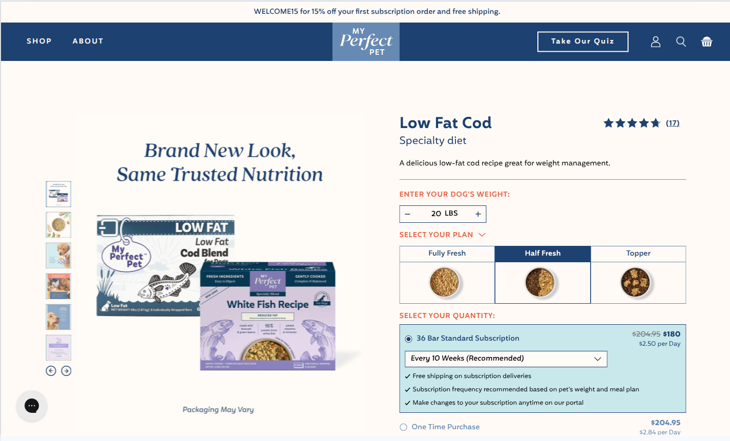
The PDP is composed in templates/product.json (and its variants) and edited per-template in Customize → Products → (template).
The default product.json template renders the PDP V2 layout, plus a stack of brand-pillar sections beneath the buy box. Several alternative templates exist for A/B tests and small-SKU products — they share most settings and only differ in which version checkbox is on.
Which template is a product using?
Open Shopify Admin → Products → (product) → Theme template to see and change the template assigned to a product. The default selection is product.json.
Product templates
| Template | Version flag(s) on | Notes |
|---|---|---|
product.json | v2_pdp | Canonical default — used by most products. |
product.pdp-cost-per-day.json | v2_pdp, cost_per_day | Adds the weight input + cost-per-day display. |
product.pdp-v3.json | v3_pdp, cost_per_day, small_sku, trial_subscribe | Experimental V3 layout with all feature flags on. |
product.pdp-v4.json | v4_pdp, cost_per_day, small_sku, trial_subscribe | Experimental V4 layout. |
product.pdp-v5.json | v5_pdp, cost_per_day, small_sku, trial_subscribe | The current PDP design (V5 layout) — also adds New Look, Blocks V2, and Quiz V2 sections below the buy box. |
product.small-sku.json | v2_pdp, small_sku, cost_per_day, trial_subscribe | Layout tuned for small / trial-pack SKUs. |
Check the assigned template before changing a layout
product.json (V2) is the default template, but the current PDP design — the mobile purchase bar (pdp_sticky_cta), the calorie-based feeding calculator and the Theme B pricing display — is the V5 layout (product.pdp-v5.json → product-v5 + product-form-v4 snippets). Which products are assigned to which template is set in Shopify Admin and isn't recorded in the theme repo, so check it there. Don't move products between templates without coordinating with the brand/marketing team — some templates are part of running A/B tests.
Main Product section
Section file: main-product.liquidEditor name: PDP Settings
This single section contains the buy box, image gallery, variant/subscription selector, tabs, and "Find in Store" CTA. The layout it renders is decided by the checkboxes below.
Layout flags
| Setting | ID | Type | Default | What it does |
|---|---|---|---|---|
| PDP V2 version | v2_pdp | Checkbox | true | Renders the product-v2 snippet — the production layout. |
| PDP V3 version | v3_pdp | Checkbox | false | A/B variant V3. |
| PDP V4 version | v4_pdp | Checkbox | false | A/B variant V4. |
| PDP V5 version | v5_pdp | Checkbox | false | Renders the product-v5 snippet — the V5 layout. |
| Cost per day | cost_per_day | Checkbox | false | Show the cost-per-day display under the price. |
| Small SKU | small_sku | Checkbox | false | Compact layout tuned for trial-size SKUs. |
| Show Trial Subscription | trial_subscribe | Checkbox | false | Adds the "try a trial" subscription option to the purchase modes. |
Only one version flag at a time
Turn on exactly one of v2_pdp / v3_pdp / v4_pdp / v5_pdp. main-product.liquid checks them in the order v2 → v3 → v4 → v5 and renders only the first one that is on; with none on, the legacy default layout renders. The version templates above already set the correct combination — don't manually toggle these on product.json.
Ingredients matching
The PDP shows an "ingredients" section under the heading set in Heading (default: WHAT'S INSIDE?). It pulls visible ingredients from a Shopify navigation menu that's matched against the product's tags.
| Setting | ID | Type | Default | What it does |
|---|---|---|---|---|
| Heading | title | Text | WHAT'S INSIDE? | Section heading shown above the ingredient list. |
| Ingredients List Reference | ingredients_list | Link list | — | The Shopify navigation menu that lists every ingredient as a top-level link. |
| Ingredients Tag Reference | ingredients_tag_ref | Text | ingredients- | Prefix stripped from product tags before matching them against menu links. |
How matching works: every product tag starting with ingredients- (e.g. ingredients-lamb) is stripped of the prefix, slugified, and looked up against the navigation menu's links. Matching links render as cards.
Adding a new ingredient
- Online Store → Navigation → Menus → (Ingredients menu) — add a top-level link with the ingredient name.
- Tag every product that contains the ingredient with
ingredients-<handle>(e.g.ingredients-pumpkin). - The card appears automatically — no theme change.
Default product.json layout
The canonical product page renders these sections in order (read from the JSON template):
| # | Section | Notes |
|---|---|---|
| 1 | section-banner | Disabled in product.json — top-of-page promo strip, off by default |
| 2 | main-product | The buy box / gallery / tabs (described above) |
| 3 | section-blocks-bg (first instance) | A row of "Item" blocks (image + headline + body) on a colored background. Typically used for "Why fresh" value props. |
| 4 | section-headline-text-button | Mid-page text + image + CTA — "Fueled by Love, Backed by Science" |
| 5 | section-related-products | Disabled by default — see Related Products below |
| 6 | section-blocks-bg (second instance) | Second row of "Item" blocks, typically used for "How to switch / subscribe" value props |
| 7 | apps | Shopify app embed block (Junip review widget, etc.) |
| 8 | section-reviews-junip | Disabled by default — Junip review carousel (see Reviews below) |
Variants of product.json add more sections:
product.pdp-v5.jsonadds New Look, Blocks V2, and Quiz V2 between the buy box and the related-products block, and disables Section Headline Text.product.pdp-cost-per-day.json,product.small-sku.json,product.pdp-v3.jsonandproduct.pdp-v4.jsonuse the same section stack asproduct.json; only themain-productflags differ.
AI Product Insight is not placed anywhere
section-ai-block.liquid exists, but no product template includes it. Add it from the customizer if needed.
Purchase options and feeding calculator
The purchase-options block (weight input, Standard Subscription / Trial / One Time Purchase rows, plan dropdown) is rendered by Vue components under src/vue/components/Quantity/. Which one is used depends on the layout and the product's custom.feeding_formula metafield:
| Where | Component | Calculation |
|---|---|---|
V2 layout (product-form), cost_per_day off — e.g. product.json | ReCharge's own subscription widget (injected into rc-widget-injection-parent) | None — no weight input |
V2 layout, cost_per_day on | resultfrequency, or resulttrialperiod when small_sku is on | Linear model from custom.pounds_per_bar_daily |
V4/V5 layouts (product-form-v4) and PLP quick-shop popup, feeding_formula = old (or empty) | resulttrialperiodv4 | Linear model from custom.pounds_per_bar_daily |
Same places, feeding_formula = new or cat | resulttrialperiodv5 | Calorie-based model in src/utils/feedingCalc.js |
Calorie-based model (feedingCalc.js)
- Daily energy need (MER) comes from a lookup table by pet weight in lb (from the MPP Feeding Calculator Backend spreadsheet).
- Dogs: 3–80 lb, default
269kcal per bar. - Cats (
feeding_formula = cat): MER divided by 1.2, 3–35 lb, default155kcal per bar. custom.kcal_per_baroverrides the default per product.- From that it derives bars per day (rounded to 0.5 for display), days per box, cost per day (box price ÷ days per box, scaled by the selected meal plan: Fully Fresh 1, Half Fresh 0.5, Topper 0.15) and the recommended delivery frequency (every N weeks).
- The metafield value is case-insensitive (
Cat,catandCATall work).
Prices shown per row
These are the V4/V5 purchase options (resulttrialperiodv4 / resulttrialperiodv5), used on the V4/V5 PDP and in the PLP quick-shop popup. Each row shows a price and a "$X per Day" line:
| Row | Price shown | "per Day" line |
|---|---|---|
| Standard Subscription | One-time price + shipping_cost struck through, then the subscription price | Same figure as the Trial row (see below) |
| Trial Subscription | Trial plan price (separate trial product) | Same figure as the Standard row (see below) |
| One Time Purchase | Price + shipping_cost | Calculated from price + shipping_cost |
- Price format: the struck-through price and the One Time Purchase price always have two decimals ("$218.95"). The subscription and trial prices are printed as
price / 100without fixed decimals, so a whole-dollar price reads "$194" (the cart shows "$194.00"). - Shared per-day figure: the Standard and Trial rows both show one value (
calculatedDayPriceOption), calculated from the plan of the selected purchase option — the trial plan when Trial is selected, otherwise the chosen subscription plan.
"$0.00 per Day" after picking One Time Purchase
The subscription plan's price is filled in only when a plan is chosen (automatically or by the shopper) while Standard Subscription is selected. When the purchase options open on the Trial default and the shopper picks One Time Purchase straight away, the Standard and Trial rows read "$0.00 per Day".
Theme B pricing experiments (staging only)
Theme B (staging) runs a different purchase-options display (V4/V5 PDP and PLP popup) for an Intelligems test. It is not on Theme A:
- Per-row cost per day: each row shows its own "$X per day", calculated from that row's price — the subscription price with the standard box bars, the trial price with the trial box bars (
custom.bars_subscribe), and price +shipping_costfor One Time Purchase. A per-day line is hidden when the figure would be zero. - Green savings: "(You save $X)" in green under the per-day line of the Standard row (struck-through one-time price minus the subscription price) and the Trial row (
shipping_cost), e.g. "$3.77 per day" above "(You save $24.95)". - Trial compare price: the Trial row shows a struck-through price (trial price +
shipping_cost) next to the trial price. - Plan label: the purchase-option components declare
dropDownSelectedup front, so a product without a trial opens with its plan label filled in. On Theme A that label can stay blank until something else re-renders the component (products without a trial only). src/utils/feedingCalc.jsonstagingalso exports acostPerMeal()helper that no component uses.
Mobile purchase bar (pdp_sticky_cta)
Component: src/vue/components/MobilePdpCta/index.vue (wraps the V4/V5 purchase form) Setting: Theme Settings → PDP Settings → Enable sticky CTA bar
- Off (current on both Theme A and Theme B): on mobile the variants and purchase options stay inline on the page. On desktop (V5 layout) the right column scrolls inside an 813px max height instead of being sticky.
- On: mobile shows a fixed bottom bar with "Save Up To X% With Subscription" (
subscription_discount, default 10) and a Build Your Cart button that opens the purchase options in a slide-up popup. Desktop (V5) keeps the sticky right column.
Section Block Bg
Section file: section-blocks-bg.liquidEditor name: Section Block Bg
The brand-pillar section used twice on the default PDP. A headline + CTA on top, followed by a horizontal row of "Item" cards (image + title + text).
Section settings
| Setting | ID | Type | Default |
|---|---|---|---|
| Top headline (small) | headlinetop | Text | — |
| Main headline | headline | Rich text | <h2>To promote a longer, healthier life</h2> |
| Button text | text_link | Text | START MY SUBSCRIPTION |
| Button URL | link | URL | — |
| Background color | bg_color | Color | #fff |
| Mobile title arrow | title_arrows | Checkbox | false |
Blocks: block_item
| Setting | Type | Default |
|---|---|---|
| Image | Image picker | — |
| Headline | Text | Nutrient Rich |
| Text | Rich text | Whole foods often retain more vitamins and minerals than processed foods |
Two instances per PDP
The default product.json places this section twice — once above and once below the body content — with different headlines and CTAs. Each instance has its own settings; editing one doesn't change the other.
Section Headline Text Button
Section file: section-headline-text-button.liquidEditor name: Section Headline Text
Mid-PDP banner with text on one side and an image on the other.
| Setting | ID | Type | Default |
|---|---|---|---|
| Headline | headline | Rich text | <h2>Fueled by Love, Backed by Science</h2> |
| Body text | text | Rich text | Our pet's health starts in their food bowl… |
| Link text | url_text | Text | FIND YOUR BLEND |
| Link URL | url | URL | — |
| Image | image | Image picker | — |
| Mobile image | image_mobile | Image picker | — |
AI Product Insight
Section file: section-ai-block.liquidEditor name: AI Product Insight
A "click to ask AI" block. Not placed on any product template (see above). When added, the visitor clicks the CTA and the prompt below is sent to the AI insights tool.
| Setting | ID | Type | Default |
|---|---|---|---|
| Headline | headline | Rich text | <h3>See what AI knows about this product</h3> |
| Text | text | Rich text | Let AI-powered ingredient analysis and nutrition insights help you decide… |
| AI Prompt | prompt | Textarea | Tell me why I should choose this pet food product. |
| Disclaimer | disclaimer | Textarea | login may be required |
Prompt drives the response
The AI Prompt field is what gets sent to the AI tool — keep it crisp and brand-aligned. The headline and text are display only.
Reviews
The PDP shows Junip reviews in two surfaces:
Star rating under the title
snippets/junip-product-summary.liquid shows the Junip average as 5 stars. A product with fewer than 3 reviews shows five greyed-out stars instead (snippets/junip-new-badge.liquid). Clicking them opens the Junip "write a review" form. The form needs Junip's own product ID, which snippets/junip-new-badge-script.liquid (rendered once in theme.liquid) looks up from the Junip API. The same badge is used on PLP cards.
Junip widget (app block)
Embedded as an app block under apps in the template (the Junip review widget). Configure copy, layout and moderation in the Junip dashboard, not in the theme.
Reviews Junip carousel — section-reviews-junip.liquid
A custom carousel that pulls Junip reviews by product ID. Disabled by default in product.json — enable from the section toggle when you want a second review surface.
| Setting | ID | Type | Default |
|---|---|---|---|
| Small top heading | headlinetop | Text | — |
| Main heading | headline | Rich text | Loved by Pets Around the World |
| Subheading | text | Rich text | — |
| Button text | text_link | Text | — |
| Button URL | link | URL | — |
Other review sections (not used on the default PDP)
section-reviews.liquid/section-reviews-v2.liquid— alternate review layouts.section-single-review.liquid— a single featured review.section-quotes.liquid— testimonial carousel.
Related Products
Section file: section-related-products.liquid
Disabled by default on the canonical product.json. Turn it on to surface a curated grid of related items (up to 12), with hover image swap, quick add-to-cart, Junip ratings, and an "In-Store Only" badge for unavailable items.
| Setting | ID | Type | Default |
|---|---|---|---|
| Headline | headline | Rich text | Featured Favorites |
| Product list | product_list | Product list (max 12) | — |
Global fallback
If product_list is empty, the section falls back to the Related Products list set in Theme Settings → PDP Settings → related_products_list (max 4 products).
Recipe Recommendations on PDP
Section files: section-recipe-recommendation.liquid · section-recipe-recommendation-styled.liquid · section-recipe-recommendation-styled-v2.liquid
Embedded Octane AI quiz for personalized blend recommendations. The styled / styled-v2 variants add extensive CSS overrides. See Integrations → Octane AI Quiz.
Product metafields
| Metafield | Type | Used in |
|---|---|---|
custom.nutritional | Rich text | Nutritional tab content on the PDP |
custom.feeding | Rich text | Feeding guidelines tab on the PDP |
custom.short_description | Rich text | Short description under the title (V5) and in the PLP popup |
custom.bars | Number | Bars in the standard box. Also makes a PLP card show "starts at" |
custom.bars_subscribe | Number | Bars in the trial box. The Trial row needs it (plus, on the PDP, the trial_subscribe flag) |
custom.pounds_per_bar_daily | Number | Linear feeding model (V2, resulttrialperiodv4) |
custom.feeding_formula | Text: old / new / cat | Picks the feeding calculator. cat also shows the FOR CATS badge on PLP cards |
custom.kcal_per_bar | Number | Overrides the default kcal per bar (dog 269, cat 155) |
custom.enter_weight | Text | Replaces "PET'S" in the "ENTER YOUR … WEIGHT" label |
custom.related_sku | Product list | Trial / related products offered in the plan dropdown |
custom.show_find_in_store_cta | Boolean | When not false, sold-out products show "In-Store Only" + Find Store instead of "Out Of Stock" |
custom.pdp_images | Image list | PDP gallery. The first image is preloaded in theme.liquid |
custom._hide_product_in_plp | Boolean | Hides the product from collection grids and search results (not from the cart upsell list) |
custom.background_color | Text/color | Product card background color on PLP |
PLP-card-only metafields (plp_image_*, ingredients_plp, gran_free_banners, _subscribe_and_save_price_for_plp) are listed in Collection Pages.
ReCharge discount handling
A small DOMContentLoaded script in the PDP watches for .rc-option__discount elements (rendered by ReCharge) and hides them — they otherwise leak the raw decimal discount percentage to the page. No content-manager action needed; it just works.
Common content manager tasks
Move a product to the cost-per-day layout
Shopify Admin → Products → (product) → Theme template → choose product.pdp-cost-per-day. The weight input and cost-per-day display appear automatically.
Switch a cat food to the cat calculator
Set the product's custom.feeding_formula metafield to cat (and custom.kcal_per_bar if it isn't 155). The V4/V5 PDP and the PLP popup then use the cat energy curve (3–35 lb), and the PLP card shows the FOR CATS badge.
Where does "Find in Store" go?
Sold-out products (with custom.show_find_in_store_cta not set to false) show a Find Store button linking to /pages/store-locator — the Pinpoint store locator page. The legacy fallback layout in main-product.liquid (no version flag on) links to /pages/store-locator-1 instead.
Add a new "Why fresh" pillar block
Open the product in the customizer. The first Section Block Bg on the page is the value-prop row — click Add block → Item and fill in the image, headline, and text.
Disable the Featured Favorites grid for one product
The section is already disabled in the default template — assign product.json and the section stays off.
To turn it on for a specific product, first override the template (e.g. clone to product.with-related.json), then enable the section there. Don't toggle it on product.json — it will turn on for every product.
Change the WHAT'S INSIDE heading
PDP Settings → Heading. The change applies to every product using this template.