
Homepage Sections
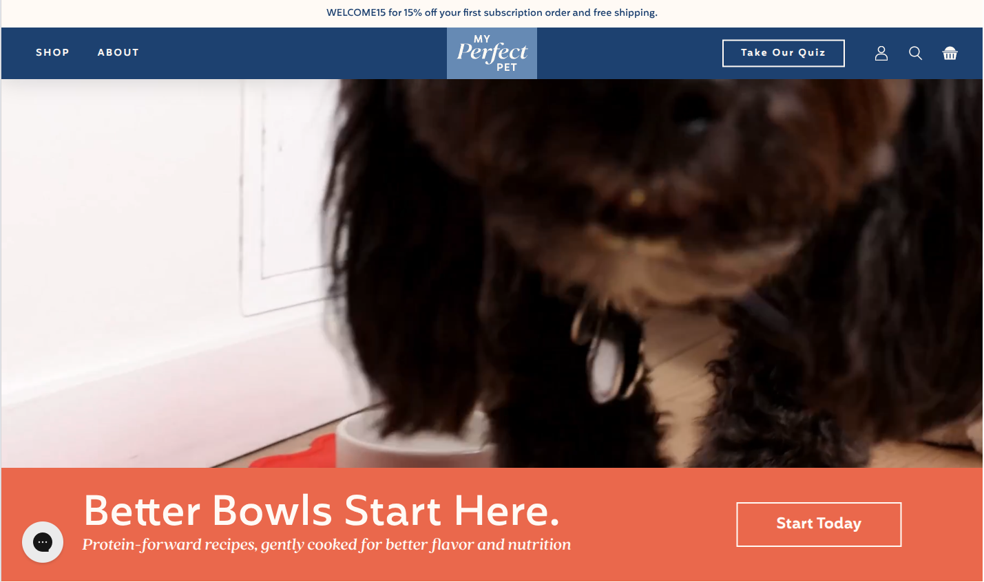
The homepage is built section-by-section from shopify/templates/index.json and edited in Customize → Home page.
The hero is section-hero-video. The legacy hero sections (section-main-home, section-main-home-v2, section-main-home-v3) are in the template but disabled — see Legacy hero sections.
Current homepage order
This is the live order from templates/index.json. Disabled rows stay in the file but don't render.
| Order | Section | Status |
|---|---|---|
| 1 | Main Home v1 | Disabled (legacy) |
| 2 | Main Home v2 | Disabled (legacy) |
| 3 | Main Home v3 | Disabled (legacy) |
| 4 | Hero Video | Active |
| 5 | Better Bowls | Active |
| 6 | New Look | Active |
| 7 | Quiz V2 | Active |
| 8 | Store Locator V2 | Active |
| 9 | Section Blends | Active |
| 10 | Switch Fresh | Active |
| 11 | New Look (second instance, different content) | Active |
| 12 | Quiz V2 (second instance) | Active |
| — | Headline Text Button | Disabled |
| — | Priority | Disabled |
| — | Reviews V2 | Disabled |
| 13 | Hero Video (second instance — bottom of page) | Active |
Why sections appear twice
Several sections (Quiz V2, New Look, Hero Video) appear twice in the order. The customizer treats each instance as a separate set of content — editing the first Quiz V2 block doesn't change the second. Customers see two different CTAs to the same quiz, with different copy and floating images.
Hero Video
Section file: section-hero-video.liquidEditor name: Hero Video
The homepage hero — a full-bleed video band with a content block (headline, subheadline, button) overlaid on a colored background. Falls back to a static image if the video doesn't load.
Video settings
| Setting | ID | Type | Default | What it does |
|---|---|---|---|---|
| Desktop Video (file) | video | Video | — | Uploaded MP4 file. Takes priority over the URL field below. |
| Desktop Video URL (mp4) | video_url | Text | — | Direct MP4 URL — used only when no file is uploaded. |
| Mobile Video (file) | video_mob | Video | — | Optional mobile video. Falls back to the desktop video when empty. |
| Mobile Video URL (mp4) | video_mob_url | Text | — | Direct mobile MP4 URL. Same fallback logic. |
Fallback image
Shown while the video buffers — and for visitors whose browser/system blocks autoplay.
| Setting | ID | Type | Default | What it does |
|---|---|---|---|---|
| Desktop Image | image | Image picker | — | Poster for the desktop video band. |
| Mobile Image | image_mob | Image picker | — | Poster for the mobile video band. |
| Minimum Height (px) | min_height | Range (0–900) | 600 | Sets the band's minimum height so the layout doesn't jump before the video paints. |
Content overlay
| Setting | ID | Type | Default |
|---|---|---|---|
| Headline | headline | Text | Better Bowls Start Here. |
| Subheadline | subheadline | Text | — |
| Button Text | text_link | Text | Shop Now |
| Button URL | link | URL | — |
| Title Font Size (Desktop) | title_font_size | Range 24–120px | 60 |
| Title Font Size (Mobile) | title_font_size_mobile | Range 16–80px | 32 |
| Content Width | content_width | Range 300–1200px | 650 |
Colors
| Setting | ID | Type | Default | Notes |
|---|---|---|---|---|
| Background Color | bg_color | Color | #FFF8EC | Cream — matches the MPP brand. |
| Text Color | text_color | Color | #1B3A5C | Navy blue. |
| Button Background | btn_bg_color | Color | #E8664A | Coral. |
| Button Text Color | btn_text_color | Color | #ffffff | White. |
| Content Position | content_position | Select (left / center / right) | left | Where the overlay sits within the band. |
Optimize the video
Use H.264 MP4 at 5–6 Mbps. Heavier files (10 Mbps+) hurt LCP on mobile. Always set a fallback image — many phones block autoplay until interaction.
Loading behaviour and CTA
- The video starts downloading only after the page has finished loading (
preload="none", thenrequestIdleCallback). Until then the poster image (image/image_mob) paints the hero, so the fallback image is what customers see first — always set it. This keeps the multi-megabyte video from competing with critical resources and delaying LCP on mobile. - The button only renders when both
text_linkandlinkare filled in. It uses the shared.buttonstyle with thebtn_bg_color/btn_text_colorcolors and turns navy on hover.
Current homepage configuration
| Instance | Video | Poster images | Min height | Content |
|---|---|---|---|---|
Top (section_hero_video_v2) | MPP Homepage-Desktop 2x_5mbps.mp4 / MPP Homepage Mobile 2x_5Mbps.mp4 (uploaded files) | Same screenshot for desktop and mobile | 0 | No headline or button — the video carries the message |
Bottom (section_hero_video_CWmHJx) | none | Rectangle_1853.jpg / Lifestyle_image.jpg | 450 | No headline or button. Custom CSS sets a 113% aspect box on phones under 500px |
The same section is also used as the prefooter on collection.json and as the hero of the Shipping page (page.shipping.json).
Better Bowls
Section file: section-better-bowls.liquidEditor name: Better Bowls
A compact text band that introduces the brand promise — headline, subheadline, and one CTA. No image / no video.
| Setting | ID | Type | Default |
|---|---|---|---|
| Headline | headline | Text | Better bowls start here. |
| Subheadline | subheadline | Text | Protein-forward recipes, gently cooked for better flavor and nutrition |
| Button Text | text_link | Text | Start today |
| Button URL | link | URL | — |
New Look
Section file: section-new-look.liquidEditor name: New Look
A two-column text + image section with extensive layout fine-tuning controls and a row of ingredient image blocks that scroll horizontally underneath.
Content settings
| Setting | ID | Type | Default |
|---|---|---|---|
| Headline | headline | Rich text | New Look, Same Ingredients, Better Nutrition. |
| Headline Font Family | headline_font | Select (inherit / Quincy CF, serif) | inherit |
| Description | text | Rich text | We've refreshed our packaging… |
| Description Max Width (px) | text_max_width | Range 200–800 | 420 |
| Button Text | text_link | Text | Learn More |
| Button URL | link | URL | — |
Image settings
| Setting | ID | Type | Default |
|---|---|---|---|
| Desktop Image | image | Image picker | — |
| Mobile Image | image_mob | Image picker | — |
| Image Position | image_position | Select (right / left) | right |
Layout / fine-tuning
| Setting | ID | Type | Default |
|---|---|---|---|
| Text Column Width (%) | text_width | Range 20–80 | 40 |
| Image Column Width (%) | image_width | Range 20–80 | 60 |
| Image Scale | image_scale | Range 50–200% | 125 |
| Image Offset X (px) | image_translate_x | Range -100–100 | 40 |
| Gap Between Columns (px) | columns_gap | Range 0–100 | 0 |
Animation
| Setting | ID | Type | Default |
|---|---|---|---|
| Enable Animation | enable_animation | Checkbox | false |
| Callout Text | callout_text | Rich text | Same drool-worthy meals! |
Blocks: ingredient_image
Each block is one ingredient tile in the row beneath the main image.
| Setting | Type | Purpose |
|---|---|---|
| Desktop Image | Image picker | Ingredient image (desktop) |
| Mobile Image | Image picker | Ingredient image (mobile) |
Two instances on the homepage
The homepage uses two New Look instances with different copy and different images — one mid-page, one further down. Edit each instance independently in the customizer.
Quiz V2
Section file: section-quiz-v2.liquidEditor name: Quiz V2
CTA bar pointing to the recipe-recommendation quiz, with floating decorative images on the left and right of the content.
Section settings
| Setting | ID | Type | Default |
|---|---|---|---|
| Headline | headline | Text | Not sure which blend is right for your pet? |
| Description | text | Rich text | — |
| Button Text | text_link | Text | Take Our Quiz |
| Button URL | link | URL | — |
| Headline Font Family | headline_font | Select (Quincy CF, serif / inherit) | Quincy CF, serif |
| Image Layout | image_layout | Select (floating / background) | floating |
| Section Margin Top (px) | section_margin_top | Range -200–200 | -90 |
| Container Padding Top (px) | container_padding_top | Range 0–300 | 150 |
| Container Padding Bottom (px) | container_padding_bottom | Range 0–300 | 70 |
The negative top margin
The default -90px top margin pulls Quiz V2 up under the previous section (e.g. New Look) so the floating images appear to overlap with it. Adjust this when the surrounding sections change height.
Blocks
| Block type | Limit | Settings |
|---|---|---|
floating_left | 2 | image (desktop), image_mobile |
floating_right | — | image (desktop), image_mobile |
Store Locator V2
Section file: section-store-locator-v2.liquidEditor name: Store Locator V2
Headline + description + CTA, with a horizontal carousel of retailer logos beneath.
Section settings
| Setting | ID | Type | Default |
|---|---|---|---|
| Headline | headline | Text | Find Us At Your Local Store |
| Description | description | Rich text | Visit our store locator to shop our products at a location near you. |
| Button Text | text_link | Text | Store Locator |
| Button URL | link | URL | — |
Current homepage values: button Find A Store → /pages/store-locator (the Pinpoint store locator page).
Blocks: carousel_image
Each block is one retailer logo.
| Setting | Type | Default | What it does |
|---|---|---|---|
| Image | Image picker | — | Logo (SVG/PNG with transparent background recommended). |
| Desktop Max Width (px) | Range 100–500 | 240 | Per-logo width cap on desktop. |
| Mobile Max Width (px) | Range 50–300 | 150 | Per-logo width cap on mobile. |
Section Blends
Section file: section-blends-blocks.liquidEditor name: Section Blends
A two-column layout with a text block on one side and a Keen Slider carousel of blend cards on the other.
Section settings
| Setting | ID | Type | Default |
|---|---|---|---|
| Reverse layout | reverse_layout | Checkbox | false |
| Title | text_headline | Text | MADE with love, backed by science |
| Description | text | Rich text | Our pet's health starts in their food… |
| Button Text | text_link | Text | BROWSE ALL BLENDS |
| Button URL | link | URL | — |
Blocks: card_item
Each block is one blend card in the carousel.
| Setting | Type | Default |
|---|---|---|
| Image | Image picker | — |
| Title | Text | High Quality & Fresh Ingredients |
| Text | Rich text | Whole foods sourced in the USA… |
| Sourced | Text | * Lamb sourced from New Zealand |
Switch Fresh
Section file: section-switch-fresh.liquidEditor name: Section Switch Fresh
A before / after image comparison with two headlines (top + bottom), one CTA, and a row of feature blocks beneath. Optional decorative fish image in the top-right corner.
Section settings
| Setting | ID | Type | Default |
|---|---|---|---|
| Top headline | headline | Rich text | <h2>Why make the switch to fresh food?</h2> |
| Bottom headline | headline_bottom | Rich text | <h2>To promote a longer, healthier life</h2> |
| Body text | text | Rich text | Give Them Something to Wag and Purr About |
| Button text | text_link | Text | Explore Better Nutrition |
| Button URL | link | URL | — |
| Before image | before | Image picker | — |
| After image | after | Image picker | — |
| Fish top-right image | fish_image | Checkbox | false |
Blocks: text (Content)
Each block is one feature beneath the comparison.
| Setting | Type | Default |
|---|---|---|
| Headline | Text | Nutrient Rich |
| Content | Rich text | Gently cooked food often retains more vitamins and minerals… |
| Icon | Image picker | — |
Available but currently disabled
These sections sit in index.json with disabled: true and don't render. Enable them from each section's toggle in the customizer.
Headline Text Button
Section file: section-headline-text-button.liquid · Section Headline Text
Two-column richtext + CTA section. Settings: headline, text, url_text (default FIND YOUR BLEND), url, image, image_mobile.
Priority
Section file: section-priority.liquid · Section Priority
Long-form brand pillar section ("Backed by Science, Praised by Vets") with rich-text body and one image. Settings: headline, text, url_text (default Find a store nearby), url, image.
Reviews V2
Section file: section-reviews-v2.liquid · Section reviews v2
Customer review carousel.
| Setting | Type | Default |
|---|---|---|
headlinetop | Text | — |
headline | Rich text | <h2>Loved by Pets Around the World</h2> |
text | Rich text | <p>Give Them Something to Wag and Purr About</p> |
text_link | Text | More Happy Pet Parents |
link | URL | — |
Blocks: review_item — image, text, title (author, e.g. - Stanley).
Legacy hero sections (disabled)
These legacy heroes are in the template but disabled. Their content stays in index.json, so they can be enabled from the customizer if needed.
| Section file | Description |
|---|---|
section-main-home.liquid | v1 — full-width background image with headline, subtitle, and two CTA image links (Shop Dog / Shop Cat). |
section-main-home-v2.liquid | v2 — split layout with background image and content card, configurable colors / font sizes. |
section-main-home-v3.liquid | v3 — bullet-point hero with custom check icons and a single CTA. |
Don't enable these
They don't match the current brand design. If you want a different hero, edit the active Hero Video section instead. Enabling a legacy hero stacks two heroes on top of each other.
Sections used elsewhere (not on the homepage)
These sections exist in sections/ and are documented either on other pages or are available as add-ons. They are not on the live homepage.
| Section file | Typical home | Reference |
|---|---|---|
section-banner.liquid | PDP / page templates | (Banner — 2/3 image + 1/3 text layout) |
section-hero.liquid | Page templates | (Generic image hero with text overlay card) |
section-newsletter.liquid | Page templates / footer-adjacent | Klaviyo signup; see Theme Settings for the global Klaviyo ID. |
section-faqs.liquid | FAQ page | FAQ accordion |
section-quotes.liquid | Various | Customer testimonial carousel |
section-table.liquid | Various | Comparison table (MPP vs. competitors) |
section-text-loop.liquid | Various | Scrolling text marquee |
section-trial-works.liquid | Trial / landing pages | "How the trial works" 3-step explainer |
section-praised.liquid | Various | "Praised by vets" social proof |
section-best-sellers.liquid | Various | Featured best-selling products |
section-store-locator-hp.liquid | — | Legacy, not used — the homepage uses Store Locator V2 |
section-other-brands.liquid | Store locator page | "Looking For Our Other Brands?" row — see Store Locator |
section-boxes-image-text.liquid | Shipping, Refund Policy pages | Text + image — see below |
section-gradient-text.liquid | Shipping page | Centered text band — see below |
section-blends-blocks-old.liquid | — | Legacy fallback, not used — use Section Blends |
section-switch-fresh-old.liquid | — | Legacy fallback, not used — use Switch Fresh |
Content page sections
Section boxes (Shipping, Refund pages)
Section file: section-boxes-image-text.liquid · Section boxes
Headline + rich text on the left, optional image on the right. Used three times on the Shipping page and on the Refund Policy page.
| Setting | ID | Type | Default |
|---|---|---|---|
| Headline | headline | Text | Shipping Policy |
| Text | text | Rich text | Shipping policy copy |
| Image | image | Image picker | — |
| Mobile image | image_mobile | Image picker | — |
| Show Image | show_image | Checkbox | true |
| Headline gradient | show_gradient | Checkbox | true |
The mobile image is used below 640px. Leave it empty to use the desktop image on mobile. Text and image columns stack full-width below 1024px. h5 headings in the text are styled orange.
Section gradient (Shipping page)
Section file: section-gradient-text.liquid · Section gradient
One rich-text setting (text). It renders as a centered navy-light band (max 1260px wide) with cream text.
Shipping page (page.shipping.json)
Section order: Hero Video ("Our Shipping Policy") → Section boxes → Section boxes ("Delivery Quality") → (Float image text, disabled) → Quiz V2 ("Other Important Information", floating images, no button) → Section boxes ("Questions? We're happy to help.") → Section gradient. The Quiz V2 section has extra styles for this page in src/css/components/section-quiz-v2.scss.
Policy pages
Shopify's built-in policy pages (Refund, Privacy, Terms, etc.) use the brand styles: title in Quincy (same as headline_2), navy 20px body text and branded bullet lists (.shopify-policy__title, .shopify-policy__body, .shopify-policy__container in src/css/components/utils-class.scss). main-page.liquid uses the same styles. The Accessibility page's lists use bullets.