
Collection Pages
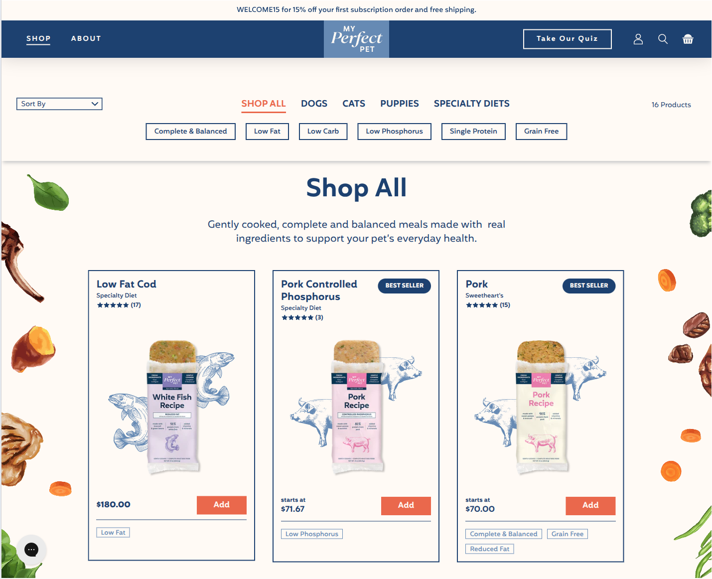
Collection pages (PLP) use the custom isotope filter layout. Every product is loaded into one big grid and filtered client-side by collection tab and diet/ingredient tags. The grid is flanked by two decorative images and can include an optional featured Best Sellers card. Theme A and Theme B have the same PLP.
Collection templates
Assigned in Shopify Admin → Products → Collections → (collection) → Theme template.
| Template | Default behaviour |
|---|---|
collection.json | Canonical layout — used by most collections. |
collection.cats.json | Same main-collection setup as collection.json — reserved for cat collections. |
collection.variety-packs.json | Two main-collection instances. The active one uses standard mode (isotope off) with one tab. The second (isotope, full tab set) is disabled so the two setups can be swapped quickly. |
All three templates render through main-collection.liquid — what differs is the per-template content (images, Best Sellers Block, filter list, tabs).
collection.json and collection.cats.json also stack section-hero-video.liquid under the grid as a prefooter band ("Nutrition that looks good, and tastes even better."):
| Template | Prefooter button |
|---|---|
collection.json | Take Our Quiz → /pages/recipe-recommendation |
collection.cats.json | "Shop Now" with an empty link, so no button renders (the Hero Video button needs both text and link) |
Main Collection section
Section file: main-collection.liquidEditor name: Collection
The section that builds the PLP: collection tabs, description, diet filter pills, sort + count row, product grid, optional Best Sellers card.
Page structure (isotope mode)
Top to bottom:
- Header block (with a soft bottom shadow), rendered by
snippets/layout-sort-bar-isotope.liquid:- Collection tabs, a full-width row (one button per block that has a URL), uppercase, centered, bottom border.
- Collection description, centered in Quincy (28px desktop / 18px mobile). It swaps when a tab is clicked, using that tab's
description, and is hidden when empty. - Diet filter pills (
filtersVue component) from the Ingredients filter setting. On mobile they scroll horizontally edge to edge.
- Sort + count row (
snippets/layout-sort-count-isotope.liquid): the sort dropdown on the left, "N Products" on the right, aligned with the grid. - Skeleton placeholders (6 grey cards) while isotope initialises; the grid fades in afterwards.
- Product grid (3 columns desktop, 2 below 1024px), with the optional Best Sellers card.
- "No products" message when the filters match nothing.
The page title (h1 #collection-title) is in the markup, and clicking a tab updates its text, but it is hidden (hidden class) — the tab row and description do its job. theme.liquid also drops the usual top padding on collection pages.
Filter modes
The section has two filter modes controlled by the Isotope filter checkbox.
Isotope mode (default, on)
When isotope_filter is true:
- Products are loaded from the
allcollection (up to 2000 items via pagination), whatever collection URL is open. - Filtering happens on the client. A tab filters by its
filter_class, and pills add diet tags on top. Several pills can be active at once, and pills with no matching products for the current tab are hidden. - On page load, the tab whose URL matches the current path is activated.
- Products with
custom._hide_product_in_plp = trueor the taginternal_onlyare hidden entirely. - "No products" is shown when the filters return nothing.
Standard mode
When isotope_filter is false:
- Native Shopify pagination is used (up to 1000 per page) on the collection itself.
- The standard sort bar (
layout-sort-bar) is shown, and the description sits above the grid. - Only
custom._hide_product_in_plpis respected —internal_onlytags don't apply here.
Which mode is live?
collection.json and collection.cats.json use isotope mode. collection.variety-packs.json uses standard mode. Standard mode is for collections with too many products to render at once, or where SEO requires real pagination URLs.
Sorting
| Option | Value | Sorts by |
|---|---|---|
| Sort By (initial) | original-true | Order the products came in |
| Price, low to high / high to low | price-true / price-false | Price in the card's price element |
| Alphabetically, A-Z / Z-A | name-true / name-false | Title |
On first load, the grid is sorted by stock, highest first (data-inventory = first variant's inventory) until the shopper picks an option. Choosing a sort hides the Best Sellers card.
The sort control is a native select (#sort-select in layout-sort-count-isotope.liquid); the sorting logic is in shopify/assets/script.static.js. Because the option list is drawn by the browser, an open list stays where it was drawn if the page scrolls underneath it (mostly noticeable on mobile).
Section settings: Filter & hero
| Setting | ID | Type | Default | What it does |
|---|---|---|---|---|
| Isotope filter | isotope_filter | Checkbox | true | Switch between isotope (client-side) and standard (paginated) modes. |
| Image Left | image_left | Image picker | — | Decorative image on the left of the grid (hidden below 1024px). |
| Image Right | image_right | Image picker | — | Decorative image on the right of the grid (hidden below 1024px). |
| Ingredients filter | isotope_gradients | Textarea | Complete & Balanced, Low Fat, Low Carb, Low Phosphorus, Single Protein, Grain Free | Comma-separated list of diet/ingredient filter pills. Each entry becomes a pill that matches a product tag (see the tip below). |
How a pill matches products
Each pill label is turned into a tag slug: lowercased, symbols removed, spaces replaced by hyphens. "Complete & Balanced" → complete-balanced, "Low Phosphorus" → low-phosphorus. A product appears under the pill when it has exactly that tag. Product tags become CSS classes on the card, so the match is case-sensitive.
Section settings: Best Sellers Block
A standalone product card placed in the grid when enabled. Useful for highlighting a variety pack or trial bundle. It has its own quick-shop popup and Add button.
| Setting | ID | Type | Default | What it does |
|---|---|---|---|---|
| Enable Best Sellers Block | bs_block_enable | Checkbox | false | Master on/off. Currently off on all templates. |
| Product | bs_block_product | Product | — | The product the card sells (currently sampler-pack). |
| Label | bs_block_label | Text | Want a mix? | Small eyebrow above the title. |
| Title | bs_block_title | Text | Best Sellers Variety Pack | Card heading. |
| Description | bs_block_description | Textarea | A variety of some of our favorite recipes… | Body copy under the title. |
| Features label | bs_block_features_label | Text | Contains 4 of our Best Selling Recipes: | Caption above the feature list. |
| Features (comma separated) | bs_block_features | Text | Beef, Chicken, Turkey & Wild Salmon, Beef & Chicken | Recipe names rendered as a bullet list. |
| Block image (right side) | bs_block_image | Image picker | — | Photo on the card (falls back to the product image). |
Blocks: Collection (tabs, max 8)
Each block is one tab in the header row.
| Setting | ID | Type | Default |
|---|---|---|---|
| Headline | headline | Text | Adult Dogs |
| URL | url | URL | — |
| Description | description | Textarea | Gently cooked, complete and balanced meals… |
| Class Filter for Product Collection | filter_class | Text | adult-dog-collection |
In isotope mode a block with a URL becomes a tab button that filters the grid by filter_class. Blocks without a URL are not shown. In standard mode the block's URL decides which tab is active.
Current tabs on collection.json / collection.cats.json:
| Tab | URL | filter_class |
|---|---|---|
| Shop All | /collections/shop-all | * |
| Dogs | /collections/adult-dogs | .bleands-adult-dog-collection |
| Cats | /collections/cats | .bleands-cats-collection |
| Puppies | /collections/puppies-moms | .bleands-puppies-moms-collection |
| Specialty Diets | /collections/specialty-diet-blends | .speciality-diet-collection |
| Variety Packs | /collections/variety-packs | .variety-packs-collection |
Class names must match
filter_class is a CSS selector that has to match a class on the product cards. Cards get one class per product tag, so .bleands-cats-collection matches products tagged bleands-cats-collection (spelling included). If no card has the class, the tab shows zero results.
Product card on PLP
Cards render through the layout-product snippet (v2 card layout, because version_plp is on). The same card is used on the search results page.
Top row
- Product title and, under it,
custom.ops_subname(whenops_subnameis on) or the SKU. - Junip stars. Products with fewer than 3 reviews show five greyed-out stars that open the Junip review form. See Product Pages → Reviews.
- Badge on the right:
| Condition | Badge |
|---|---|
custom.gran_free_banners is set | Navy BEST SELLER pill |
custom.feeding_formula = cat | Cat icon + light-navy FOR CATS pill |
Image
- If
custom.plp_image_static,custom.plp_image_hoverandcustom.plp_image_backgroundare all set: layered background + static image, crossfading to the hover image. - Otherwise the featured image with the second image on hover, on the
custom.background_colorbackground.
Price row
| Case | Shows |
|---|---|
custom._subscribe_and_save_price_for_plp set | "starts at" + that price |
No PLP price but custom.bars set (e.g. the fish blends, which have no small SKU) | "starts at" + product.price (the Standard Subscription price) |
| Otherwise | Product price (red with compare-at price when on sale) |
Sold out, custom.show_find_in_store_cta not false | "In-Store Only" + Find Store button → /pages/store-locator |
Sold out, show_find_in_store_cta = false | "Out Of Stock" |
The Add button opens the quick-shop popup (below).
Ingredients — pills from the comma-separated custom.ingredients_plp.
Other rules:
- Products with
custom._hide_product_in_plp = trueare never rendered. - Title rows and ingredient areas are equalised to the tallest card so rows line up. The heights are measured only while the whole grid is visible, so cards keep their size when a filter is applied.
Quick-shop popup
Component: product-popup (src/vue/components/ProductPopup/)
Clicking Add on a card opens a popup with the product accordion (description, ingredients, nutrition, feeding) and the full purchase form: pet-weight input, purchase options (resulttrialperiodv4 or resulttrialperiodv5 depending on custom.feeding_formula — see Product Pages → Purchase options), quantity and Add To Cart. On mobile the quantity + button row is fixed to the bottom of the screen.
- The popup resets the shared product store each time it opens, so it never inherits the variant, plan or quantity of the previous card.
- After Add To Cart ("Adding..." while it runs), the popup closes and the cart drawer opens with the new line already drawn (instant cart updates).
Other collection-related sections
Section Collection (embed)
Section file: section-collection.liquid
Embeds a collection's products inside any page template — used on landing pages.
Collection Slider
Section file: section-collection-slider.liquid
Carousel/slider variant of a collection list — used for "Shop the collection" strips inside content pages.
List Collections
Section file: main-list-collections.liquidTemplate: templates/list-collections.json
The /collections index page that lists every collection as a card.
PLP global settings
These live in Theme Settings → PLP Settings and affect every collection page. See Theme Settings for the full reference.
| Setting | Effect |
|---|---|
build_subscription_button | Passed to cards and to the header search ("build" mode). |
version_plp | Switches between PLP card layouts (v2 is on). |
ops_subname | Shows the operational/SKU subname on each card. |
Page templates that embed collections
Several non-collection templates feature embedded product grids — handled by section-collection.liquid / section-collection-slider.liquid, not by main-collection:
| Template | Purpose |
|---|---|
page.subscribe-now.json | Subscription landing page with featured products |
page.landing-page.json | Marketing landing page with product showcase |
page.landing-page-conversion.json | Conversion-optimized landing |
page.landing-page-trial-bars.json | Trial bar products landing page |
page.landing-page-sales.json | Sale / promotion landing |
page.landing-page-promo.json | General promotion page |
Common content manager tasks
Add or rename an ingredient filter pill
Main Collection → Ingredients filter. Edit the comma-separated list — order is the display order. Then tag every product that should match with the pill's slug (e.g. pill "Grain Free" → tag grain-free, all lowercase). See How a pill matches products.
Add a new tab above the grid
Main Collection → Add block → Collection link. Set a URL (tabs without a URL are hidden), a headline, an optional description, and the filter_class selector that matches a product tag.
Show the Best Sellers Block on collection.json
Main Collection → Best Sellers Block → Enable Best Sellers Block. Pick the variety-pack product, set the copy, and upload a product photo.
Mark a product as a cat food on the PLP
Set custom.feeding_formula to cat. The card shows the FOR CATS badge and the quick-shop popup uses the cat feeding calculator.
Hide a product from all collections
Set its custom._hide_product_in_plp metafield to true. The product keeps its live URL but doesn't appear in any PLP or search results.
Switch a collection to native pagination (for SEO)
Main Collection → Isotope filter → uncheck. The page then uses native Shopify pagination — useful for large collections where the 2000-item isotope load would be slow.