
Homepage & Content Sections
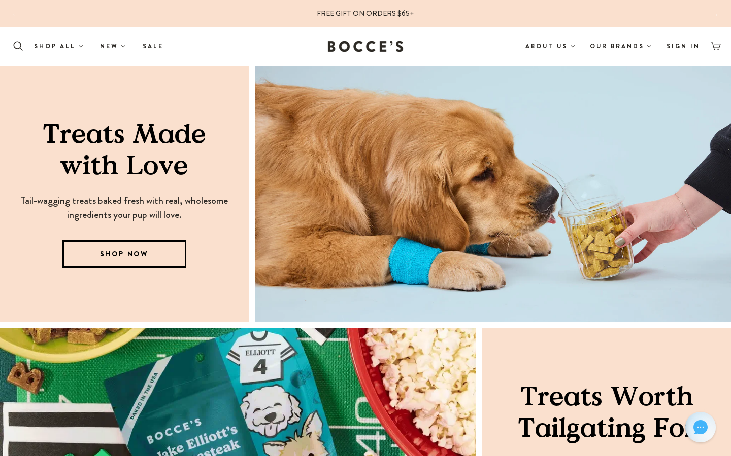
The homepage is templates/index.liquid, which outputs the customizer sections (content_for_index). All dynamic-* and section-* sections can be added through the Theme Customizer, to the homepage or to any JSON page template.
Current homepage stack
Theme A, top to bottom:
| # | Section | Content |
|---|---|---|
| 1 | dynamic-image-with-text | NFLPA hero |
| 2 | dynamic-image-with-text | Halloween hero |
| 3 | dynamic-image-with-text | Froyo hero |
| 4 | dynamic-image-with-text | Bocce's Spa hero |
| 5 | dynamic-image-with-text | Jerky Cuts hero |
| 6 | dynamic-collection | "Our Best Sellers" (bocces-best-sellers) |
| 7 | dynamic-collection | "Shop Bocce's Spa" (bocces-spa) |
| 8 | dynamic-collection-list | "Featured Collections" |
| 9–13 | section-block-1 … section-block-5 | Disabled (placeholder copy) |
| 14 | dynamic-image-with-text-contained | Ingredients image |
| 15 | dynamic-slideshow | |
| 16 | dynamic-testimonial-list | |
| 17 | dynamic-logo-list | Press logos |
| 18 | instafeed | Instagram feed |
Dynamic Image with Text
Section file: dynamic-image-with-text.liquid (editor name Image with text). This is the main hero and campaign block, used five times on the homepage and on most landing pages.
| Setting | ID | Type | Notes |
|---|---|---|---|
| Show Section | show_section | checkbox | Hide without deleting |
| Show spacing | margin | select | regular / none |
| Image / Image (Mobile) | image, image_mobile | image | |
| Image layout | alignment | select | left, right, full, full-left, full-center, two-thirds-left, two-thirds-right |
| Desktop / Mobile height | desktop_height, mobile_height | select | natural … extra-large |
| Parallax / Lazy load | parallax, lazy_load | checkbox | |
| Background Color / Opacity | color, opacity | color / range | |
| Heading / Heading (Mobile) | title, title_mobile | text | |
| Show reviews badge | show_reviews_badge | checkbox | Five stars + a line of copy under the heading. Currently off everywhere |
| Reviews badge text | reviews_badge_text | text | Default "loved by 60,000" |
| Text / Text (Mobile) | content, content_mobile | richtext | |
| Primary CTA URL / Text / Text (Mobile) | cta_url, cta_text, cta_text_mobile | ||
| Secondary CTA URL / Text / Text (Mobile) | secondary_cta_url, secondary_cta_text, secondary_cta_text_mobile | ||
| Primary / Secondary Button Style | button_style, secondary_button_style | select | btn-primary, btn-secondary, btn-secondary-alt, btn-secondary-beige, btn-tertiary |
| Text after button | content_after_btn | richtext |
The badge is rendered by snippets/reviews-badge.liquid. The stars take the surrounding text colour.
dynamic-image-with-text-contained.liquid is the variant with the image inside the content width.
Other Brands
Section file: section-other-brands.liquid (editor name Other Brands).
A horizontal banner of sister-brand tiles. Each tile is an image with the brand name, linking to that brand's store locator. It is used at the bottom of the Store Locator page (page.custom-store-locator.json).
| Setting | ID | Type | Default |
|---|---|---|---|
| Heading | heading | text | "Looking For Our Other Brands?" |
Blocks: brand (max 6)
| Setting | ID | Type |
|---|---|---|
| Brand name | brand_name | text |
| Image | image | image |
| Link | link | url |
| Open link in a new tab | new_tab | checkbox (default true) |
Current tiles: Ark Naturals, Super Snouts and My Perfect Pet, each linking to its /pages/store-locator.
Store Locator page
page.custom-store-locator.json has three sections:
dynamic-text-with-cta: "Store Locator" intro, with links to Amazon, Chewy.com and Homes Alive Pets (Canada).- An
appssection with the Pinpoint Store Locator block: side layout, 360px panel, 560px min height, scroll zoom off. See Pinpoint Store Locator. section-other-brands.
Blog
blog.liquid renders main-blog and article.liquid renders main-article. The static-blog / static-article section files are also in the repo, but no template uses them.
Blog listing (main-blog.liquid)
- A hero title where the first two words of the blog title get the accent colour.
- Tag filter pills. By default the pills are the top 10 tags by article count. Set Featured tags (comma separated) (
featured_tags, the section's only setting) to choose and order the pills yourself. - Article cards (
snippets/layout-blog-article.liquid), 8 per page, with numbered pagination fromsnippets/layout-pagination.liquid(styles inlayout-pagination-styles.liquid).
Article (main-article.liquid)
- The first tag is shown as a label, then the title, date and body. The accent colour is
#f4b66a. - Keep reading: the three most recent other articles from the same blog, with a link back to the blog.
- The section has no settings.
Dynamic sections reference
| Section | File | Description |
|---|---|---|
| Slideshow | dynamic-slideshow.liquid | Full-width hero carousel |
| Side by Side | dynamic-side-by-side-image-and-text.liquid | Two-column image + text |
| Collection | dynamic-collection.liquid | Product grid from a collection (uses the standard product card with one-liner and ratings) |
| Collection List | dynamic-collection-list.liquid | Grid of collection cards |
| Blog | dynamic-blog.liquid | Recent articles |
| Product | dynamic-product.liquid | Featured single product |
| Video | dynamic-video.liquid | Video embed |
dynamic-instagram.liquid / instafeed.liquid | Instagram feed | |
| Richtext | dynamic-richtext.liquid | Rich text |
| Text with CTA | dynamic-text-with-cta.liquid | Text block + button (Store Locator intro) |
| Image CTA | dynamic-image-cta.liquid | Image with overlaid CTA |
| Icon List | dynamic-icon-list.liquid | USP icons |
| Logo List | dynamic-logo-list.liquid | "As seen in…" logos |
| Menu List | dynamic-menu-list.liquid | Menu-driven link list |
| Testimonial List | dynamic-testimonial-list.liquid | Testimonial carousel |
dynamic-twitter.liquid | Twitter/X embed | |
| What's Inside | dynamic-whats-inside.liquid | Product contents breakdown (baskets) |
| Baskets | baskets.liquid / dynamic-baskets-hero.liquid | Gift basket builder + hero |
Block Sections
| Section | File | Description |
|---|---|---|
| Block 1 | section-block-1.liquid | Headline + text + CTA (used on the Wholesale page for the two ordering options) |
| Block 2 | section-block-2.liquid | Two-column block with background colour |
| Block 3 | section-block-3.liquid | Three-column block (Innovation 2026 page) |
| Block 4 | section-block-4.liquid | Four-column block |
| Block 5 | section-block-5.liquid | Five-column block (Accessibility page) |
The CTA inside these sections (.section__btn_w) uses the site-wide black hover. See Buttons: hover style.
Other custom sections
| Section | File | Status |
|---|---|---|
| Code Animation | section-code-animation.liquid | Custom animated section |
| Prepare | section-prepare.liquid | Usage / safety tips list (used on page.landing-page) |
| Help LA Fires | section-help-la-fires.liquid | Donation cards on PDPs. Currently disabled |
| Halloween Gift | section-halloween-gift.liquid | Seasonal promotion |
| AI Block | section-ai-block.liquid | "Ask AI" banner. Not included in any template |
| Blended Review Widget | section-blended-review-widget.liquid | PDP only. See Product Pages |
| Bubble Animation | section-bubble-animation.liquid | PDP bubble template only. See Product Pages |